Walk through any museum displaying the works of the late 19th-century masters, and you will inevitably find yourself stopped in your tracks by the canvases of Swedish painter Anders Zorn (1860–1920).
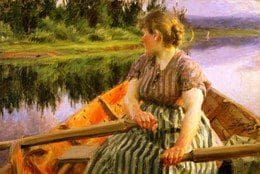
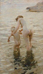
Alongside contemporaries like John Singer Sargent and Joaquín Sorolla, Zorn possessed that rare, dazzling virtuosity that made oil paint look effortless. Whether depicting Swedish village life in Mora, luminous nudes stepping out of the chilly Baltic waters, or high-society portraits of American presidents like Grover Cleveland and William Howard Taft, Zorn captured light, water, and skin with a physical immediacy that feels alive.
The Master of Restraint: What Anders Zorn Can Teach Every Painter About Light and Economy
Anders Zorn’s genius did not come from excess—it came from radical restraint. By deliberately limiting his tools, simplifying his values, and executing every mark with absolute economy, he achieved a level of luminosity that remains a benchmark for figurative painters today.
1. The Anders Zorn Palette: The Magic of Four Colors
Ask any studio painter what the name “Anders Zorn” brings to mind, and the immediate answer is his legendary limited palette. While modern art supply stores offer hundreds of specialized pigments, Anders Zorn executed some of his most radiant masterworks using just four basic colors:
- Ivory Black (acting as his blue/cool tone)
- Titanium/Flake White
- Yellow Ochre
- Cadmium Red Medium (or Vermilion)
Notice what is missing: there is no blue, no green, and no violet.
For beginner and intermediate artists, this setup sounds impossibly restrictive. How do you paint deep pine forests, ocean spray, or shimmering silks without blue or green?
The secret lies in the optical nature of Ivory Black. Ivory black is a carbon-based, cool black. When mixed with white, it yields a soft, cool slate gray that, when placed adjacent to warm yellow ochres and fiery vermilions, optically reads as a convincing, luminous blue. Mix ivory black with yellow ochre, and you unlock a complete range of rich, muted olive greens.
By eliminating saturated blues and greens, Anders Zorn eliminated the danger of garish, mismatched hues. Every color mixed from this limited family naturally harmonizes with every other color on the canvas. It is an instant cure for visual discord.
2. The Dominance of Value Over Chroma and Anders Zorn
Anders Zorn knew a fundamental truth that many painters struggle to master: value does all the work, while color gets all the credit.
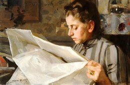
If your light and dark relationships (values) are correct, you can paint a portrait in practically any hue and the human eye will read it as three-dimensional form. Zorn’s portraits hold together with striking clarity because his value structure is bulletproof.
Instead of fragmenting a face into dozens of subtle halftones, Zorn grouped his values into broad, unified shapes:
- A clear, luminous light mass.
- A single, connected shadow shape.
- Crisp, intentional accents where deep darks anchor the form (the pupil of an eye, the corner of a lip, the edge of a collar).
By keeping his shadow masses quiet, warm, and uncluttered by unnecessary detail, his highlights appear twice as radiant.
3. The Decisive, Calligraphic Stroke of Anders Zorn
Like Sargent, Anders Zorn was a master of alla prima (wet-on-wet) painting. He approached the canvas not with timid, scrubbing motions, but with the fluid confidence of a master calligrapher.
Anders Zorn used large, flat bristle brushes loaded with generous amounts of paint. He mixed the exact tone on his palette, stepped up to the easel, and laid the mark down in a single, flowing gesture.
Watch how he renders the fabric of a silk gown or the gleam of light on water:
- He never smoothed the edges into submission.
- He allowed the physical bristle tracks to remain visible, catching ambient light in the room.
- He preserved the soft, melted edges where forms blended into shadow, contrasting them against razor-sharp edges where bone or cloth caught direct light.
This confidence gave his work a kinetic, breathing quality. His subjects never look like posed wax statues; they look as though they were caught mid-breath in natural, shifting light.
4. Water, Skin, and the Natural Elements and Anders Zorn
Anders Zorn was born in Dalarna, Sweden, and despite his international fame, wealth, and travels throughout London, Paris, and the United States, his heart remained tethered to the rural traditions and rugged landscape of his homeland.
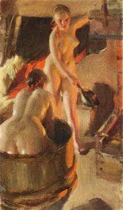
His outdoor paintings of bathers in the Stockholm archipelago and Dalarna lakes are unmatched technical studies in the behavior of light:
- The Transparency of Skin: Zorn understood that skin is not an opaque mask; it is semi-translucent. By letting warm under-tones glow through cool surface highlights, he captured the warmth of living flesh against cold northern water.
- The Motion of Water: He avoided the trap of painting every individual ripple. Instead, he treated water as a series of interlocking planar reflections, using sweeping horizontal ribbons of broken color to suggest endless movement.
Bringing Anders Zorn’s Philosophy Into Your Studio
You don’t need a northern European studio or an elite commission to put Zorn’s lessons to work. Here are three actionable ways to apply his mastery to your next painting session:
- Strip Down Your Palette: For your next three portrait or still life studies, banish all secondary and tertiary colors. Lay out only Ivory Black, Yellow Ochre, Cadmium Red, and White. Force yourself to discover how much chromatic range can be unlocked through optical relationships rather than tube variety.
- Squint to Group Values: Before touching your canvas with paint, squint at your subject until the minor details disappear. Identify where the light family ends and the shadow family begins. Paint the entire shadow mass as a single, connected shape before introducing a single feature.
- Commit and Leave It: Practice mixing your target color completely on the palette before your brush touches the linen. Put the stroke down with deliberate pressure, follow the contour of the form, and lift the brush away. If it’s wrong, scrape it off cleanly with your palette knife—never stir wet paint on the canvas into mud.
Anders Zorn proved that mastery is not about how many materials you have at your disposal, but how deeply you understand the tools you hold. By mastering value, respecting the power of edge control, and finding freedom within radical restraint, he transformed paint into light.

Anita Louise Art is dedicated to art education, great artists, and inspiring others to find and create their art. We love art that uplifts and inspires. #ArtToMakeYouSmile! #ArtToMakeYouHappy!
If you want to see any of my art, you can find out more by clicking here. If you are interested in what inspires me and my paintings, you can discover more by clicking here.
We have a free newsletter and would love you to be part of our community; you can subscribe to the newsletter by clicking here. If you have any questions, I would be happy to talk to you anytime. You can reach me, Anita, by clicking here.
Subscribe to our Anita Louise Art YouTube Channel with great videos and information by clicking here.
Join us for our podcast “5 Minutes With Art or Deep Dive with 5 Minutes With Art” Spend just a few minutes a week with us to discover and learn about great art and artists. You can find out more about our podcast by clicking here.
Related Questions
The Myth of the Tortured Artist: Is Suffering the Secret Ingredient to Greatness?
There is a persistent, almost seductive belief in the art world: that to create truly profound work, an artist must first be broken. We have romanticized the “starving artist” and the “mad genius” to the point where we sometimes wonder if stability is the enemy of creativity. But is this true? Is suffering actually a prerequisite for greatness, or is the “Tortured Artist” a myth that does more harm than good?
The Myth of the Tortured Artist: Is Suffering the Secret Ingredient to Greatness? Click here to learn more.
Van Gogh Color Symbolism: The Secret Language of Yellow and Blue and What It Reveals About the Human Soul
If you were to close your eyes and think of the name “Vincent van Gogh,” what do you see? Chances are, it isn’t just a face with a red beard. It’s a vivid display of Van Gogh Color Symbolism—a collision of colors that define his art: the searing, almost blinding yellow of a sunflower set against a swirling, deep-midnight blue. These iconic hues are more than aesthetic choices; they embody the emotional depth and creative vision that make Van Gogh’s work so unforgettable.
Van Gogh Color Symbolism: The Secret Language of Yellow and Blue and What It Reveals About the Human Soul Click here to discover more