

We often talk about history as a series of grand political shifts, treaties signed in gilded rooms, or wars fought over invisible lines. But as artists, makers, and creators, our history is recorded differently. Our history is written in pigment, line, proportion, and form. It is a quiet, ongoing conversation between maker and material that stretches across continents and centuries.
When you trace the lineage of modern visual culture back to its seismic turning points, all roads eventually lead to a single piece of carved cherry wood and Mulberry paper made in Edo-period Japan.
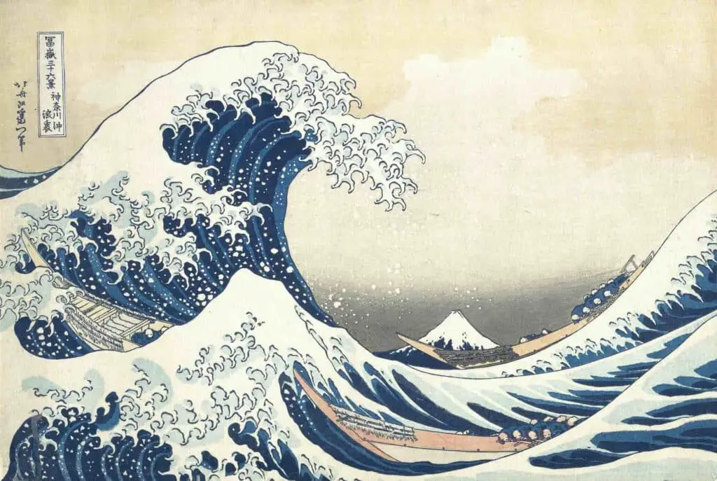
How Katsushika Hokusai’s Under the Wave off Kanagawa Woodblock Print Rewrote the Rules of Visual Art
Katsushika Hokusai’s Under the Wave off Kanagawa—universally known as The Great Wave—is arguably the most recognized artwork on Earth. Yet its familiar presence on coffee mugs, iPhone cases, and tote bags can blind us to just how radical it truly was.
When Hokusai published this print around 1831 as the first in his series Thirty-Six Views of Mount Fuji, he didn’t just capture a dramatic maritime scene. He unleashed a visual shorthand that fundamentally shattered Western rules of perspective, ignited the Impressionist revolution in Paris, and laid the precise geometric foundations for modern abstract art and contemporary digital design.
The Chemical Spark of Prussian Blue In The Wood Block Print
To understand the revolution of The Great Wave, you have to start not with the image itself, but with its chemistry.
For centuries, Japanese ukiyo-e (“pictures of the floating world”) relied heavily on organic, plant-based dyes for blue tones, primarily indigo and dayflower extract. While soft and poetic, these vegetable pigments had massive technical limitations.
They faded quickly when exposed to light, lacked deep chromatic saturation, and required painstaking, multi-layered applications to achieve any sense of shadow or weight.
Enter a synthetic chemical compound called iron ferrocyanide—known to the world as Prussian Blue.
Invented accidentally in a Berlin laboratory in the early 18th century, Prussian Blue was a synthetic marvel: deeply saturated, highly lightfast, and intensely vibrant. In the late 1820s, despite Japan’s strict policy of national isolation (sakoku) enforced by the Tokugawa shogunate, Dutch and Chinese traders smuggled significant quantities of this synthetic blue into the port of Nagasaki.
When Hokusai got his hands on it, he recognized instantly that he held a game-changer.
Prussian Blue allowed woodblock printers to execute bokashi—a specialized wet-on-block wiping technique that creates smooth, delicate color gradients. Look closely at the towering swell of The Great Wave: the pigment shifts seamlessly from a deep, velvety, almost blackish navy at the base of the wave to a radiant, electric turquoise at its crest. Traditional indigo simply could not do this. The synthetic pigment gave the water a visceral weight and dynamic kinetic energy that made the ocean feel alive.
Yet there is a poetic, quiet irony here. In a nation whose borders were officially sealed against the “foreign influence” of the outside world, Hokusai used an imported, synthetic European dye to portray Mount Fuji—the ultimate, sacred symbol of Japanese national identity and eternal permanence.
The very medium of The Great Wave carried the tension of a shifting world. It was a physical collision between traditional Japanese woodblock craftsmanship and Western chemical innovation. Japan’s borders were closed, but its creative spirit was already absorbing the world, using an imported blue to reinvent how nature itself was drawn.

The Death of the Vanishing Point In The Wood Block Print
If the pigment was the spark, Hokusai’s spatial layout was the dynamite.
Since the Early Renaissance, Western fine art had been utterly obsessed with linear perspective. Brunelleschi and Alberti had taught the Western world that a canvas was a window into three-dimensional space. Every line had to retreat neatly toward a single, mathematically calculated vanishing point on a distant horizon line. It was an academic, highly rationalized approach designed to construct an illusion of real, physical depth.
Hokusai looked at that centuries-old Western playbook and threw it out the window.
In The Great Wave, the traditional horizon line is obliterated. Instead of pulling the viewer into a deep, receding three-dimensional room, Hokusai stacks his spatial planes vertically. He flattens the image, relying on overlapping graphic layers rather than atmospheric haze to suggest distance:
- Foreground: A sharp, curling wave on the left surges forward, its violent claw-like foam suspended in mid-air.
- Mid-ground: Three slender oshiokuri-bune (fast cargo boats) cling to the trough of the sea, their human oarsmen bent low, helpless against the forces of nature.
- Background: The snow-capped peak of Mount Fuji sits quietly in the distance, framed perfectly inside the circular arc of the towering wave.
Notice what happens to Mount Fuji. By stripping away traditional linear perspective, Hokusai creates a deliberate visual illusion: the distant, massive mountain is rendered small enough to fit inside the curve of the immediate, churning water. Mount Fuji appears not as an unshakeable giant miles away, but as a tiny, vulnerable mound about to be engulfed by foam that mirrors its snowy peak.
Where Renaissance art used mathematical rigidity to appeal to the intellect, Hokusai used a fluid, circular composition to bypass the brain and hit the emotional core of the viewer. The viewer isn’t standing safely on a bank looking at a distant horizon; we are placed right down in the churning water with those desperate rowers, looking up at an overwhelming wall of ocean.
This rejection of three-dimensional realism offered a radical lifeline to European painters who were growing suffocated by the rigid rules of the Paris Salon. Hokusai proved that a flat image didn’t mean a simple image; it meant an image with boundless emotional energy.
Japonisme and the Parisian Fever And The JapaneseWood Block Print
How did a Japanese woodblock print made for everyday citizens end up sparking a total revolution in the art capitals of Europe? Through one of history’s most delicious accidents.
In 1853, Commodore Matthew Perry sailed his American steamships into Tokyo Bay, forcing Japan to open its ports to international trade. Shortly after, Japanese goods began flooding into Europe. Porcelain, lacquerware, textiles, and prints were shipped across the globe.
Because woodblock prints like ukiyo-e were mass-produced commercial items in Japan—essentially the pop art posters or book illustrations of their day—exporters often used surplus or misprinted sheets as cheap packing paper to wrap delicate ceramic bowls and teapots.
Legend has it that in 1856, French engraver Félix Bracquemond opened a crate of Japanese porcelain in Paris and found a small, crumpled volume of Hokusai Manga—a collection of Hokusai’s sketches—used as cushioning material. Stunned by the expressive economy of the linework, Bracquemond rushed to show it to his friends.
Within a decade, Paris was consumed by Japonisme—an obsessive fever for Japanese aesthetics that swept through the avant-garde.

Artists who felt trapped by academic realism found an absolute treasure trove in Hokusai’s work. They didn’t just admire The Great Wave; they devoured it.
- Claude Monet was so captivated that he collected over 200 ukiyo-e prints, filling the walls of his home in Giverny. You can trace the direct line from Hokusai’s steep, flattened perspectives and bird’s-eye views straight into Monet’s framing of his famous water lily pond and Japanese bridge.
- Vincent van Gogh spent endless hours in Paris copying Japanese prints in oil, writing to his brother Theo: “All my work is based to some extent on Japanese art…” Van Gogh took Hokusai’s thick, rhythmic outlines and dynamic energy and turned them into the swirling, expressive skies of The Starry Night.
This was not a simple matter of Western artists copying exotic Eastern motifs. It was a complete overhaul of how painters saw the canvas. Hokusai taught the Impressionists and Post-Impressionists that line and color didn’t have to mirror nature with photographic accuracy. They could be used as expressive tools to capture the feeling of a fleeting moment.
Japanese Woodblock Print – From Impressionist Light to Modern Abstraction
As the 19th century gave way to the 20th, the impact of The Great Wave broadened into something even more fundamental: it became the springboard for modern graphic design and abstract art.
Consider how Edgar Degas and Édouard Manet began composing their paintings in the 1870s and 1880s. Before encounters with ukiyo-e, Western tradition demanded that the subject of a painting be neat, self-contained, and centered within the frame.
Hokusai didn’t do that. In The Great Wave, the main swell of water enters the canvas violently from the left margin, cropped abruptly at its base. The wave isn’t fully contained inside the frame—it spills beyond it, suggesting an immense, chaotic force continuing out of sight.
Degas immediately adopted this radical “cropped” framing. His paintings of ballet dancers and racehorses suddenly began slicing subjects in half at the edge of the canvas, creating an instant sense of snapshot immediacy. It felt like real life caught in motion, precisely because it refused to fit neatly into a traditional frame.
Even deeper than framing, however, was Hokusai’s reduction of complex natural forms into pure graphic shapes.
Look closely at the crest of the wave as it breaks into foam. It isn’t rendered as soft, realistic spray. Hokusai distills the water into jagged, claw-like white fingers—fractal-like patterns that repeat across the image. He simplifies a turbulent natural phenomenon into a rhythmic, almost geometric motif:
The Structural Breakdown:
- Curved Arcs: Sweeping, concentric circles create the momentum of the wave.
- Serrated Foam: Sharp, repeated claw-like shapes replace realistic water spray.
- Negative Space: Bold, flat fields of cream sky balance the heavy indigo water.
This deliberate simplification was the direct ancestor of 20th-century movements like Art Nouveau, Cubism, and modern graphic design. When artists like Paul Gauguin or later Henri Matisse stripped away shading to focus on flat planes of color and expressive line work, they were standing directly on the foundation Hokusai laid. He demonstrated that by simplifying the physical world, an artist could express its underlying energy far more powerfully than by executing a realistic copy.
The Wave in the Digital and Neural Era
Today, nearly two centuries after Hokusai inked his wooden blocks in Edo, The Great Wave has achieved something exceedingly rare: it has become a universal visual language.
In our current digital era, defined by high-contrast mobile interfaces, minimalist graphic design, and ultra-fast visual communication, Hokusai’s 19th-century visual shorthand feels shockingly contemporary. It is no coincidence that when Unicode introduced the official wave emoji (🌊) for our smartphones, it was modeled directly on the swooping curve and clawed crest of The Great Wave.

Why does this single image remain so extraordinarily potent across every culture, medium, and generation?
Because it captures a timeless, universal human experience: the dynamic tension between human fragility and the overwhelming scale of the natural world.
Hokusai didn’t just give us a picture of a stormy day at sea. He gave us a masterclass in visual balance. He showed us how to capture chaos through structure, how to balance violence with serenity, and how to turn a fleeting second of motion into a permanent icon.
From the synthetic Prussian blue pigment brought by foreign ships to the flat, cropped geometry that reshaped European painting, The Great Wave reminds us that art history is not made in isolation. It is made at the intersections—where cultures meet, where materials collide, and where a single creator has the audacity to look at the world, discard the rules, and show us a completely new way to see.

Anita Louise Art is dedicated to art education, great artists, and inspiring others to find and create their art. We love art that uplifts and inspires. #ArtToMakeYouSmile! #ArtToMakeYouHappy!
If you want to see any of my art, you can find out more by clicking here. If you are interested in what inspires me and my paintings, you can discover more by clicking here.
We have a free newsletter and would love you to be part of our community; you can subscribe to the newsletter by clicking here. If you have any questions, I would be happy to talk to you anytime. You can reach me, Anita, by clicking here.
Subscribe to our Anita Louise Art YouTube Channel with great videos and information by clicking here.
Join us for our podcast “5 Minutes With Art or Deep Dive with 5 Minutes With Art” Spend just a few minutes a week with us to discover and learn about great art and artists. You can find out more about our podcast by clicking here.
Related Questions
The Myth of the Tortured Artist: Is Suffering the Secret Ingredient to Greatness?
There is a persistent, almost seductive belief in the art world: that to create truly profound work, an artist must first be broken. We have romanticized the “starving artist” and the “mad genius” to the point where we sometimes wonder if stability is the enemy of creativity. But is this true? Is suffering actually a prerequisite for greatness, or is the “Tortured Artist” a myth that does more harm than good?
The Myth of the Tortured Artist: Is Suffering the Secret Ingredient to Greatness? Click here to learn more.
Van Gogh Color Symbolism: The Secret Language of Yellow and Blue and What It Reveals About the Human Soul
If you were to close your eyes and think of the name “Vincent van Gogh,” what do you see? Chances are, it isn’t just a face with a red beard. It’s a vivid display of Van Gogh Color Symbolism—a collision of colors that define his art: the searing, almost blinding yellow of a sunflower set against a swirling, deep-midnight blue. These iconic hues are more than aesthetic choices; they embody the emotional depth and creative vision that make Van Gogh’s work so unforgettable.
Van Gogh Color Symbolism: The Secret Language of Yellow and Blue and What It Reveals About the Human Soul Click here to discover more.
Katsushika Hokusai: The “Old Man Mad About Drawing” Who Changed the World
We often think of “influencers” as a modern phenomenon, but Katsushika Hokusai proves that true influence transcends time and technology. In the 19th century, Katsushika Hokusai was the biggest influencer in the art world—not with a smartphone, but with a woodblock, a bowl of Prussian Blue ink, and a spiritual obsession with a mountain. His groundbreaking work continues to inspire artists and admirers around the globe.