Each year Pantone will set what they see as a color of the years. Many artists may wonder why the color of the year matters? Or why should I, as an artist, even care about it?
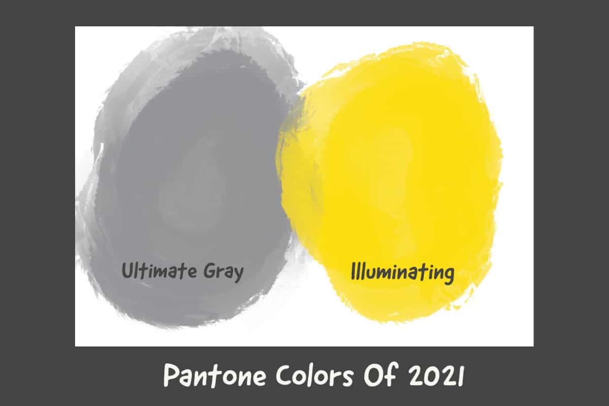
Pantone’s color of the year is important for every artist to understand because it shows the trend direction of color. Pantone is the world’s expert on colors; a team will spend over 9 months researching the color trends. Understanding these color trends is important for any artist as it shows the direction that fashion and art will be going in the coming year. Pantone’s trend color for 2021 is Ultimate Gray and Illuminating yellow. This is only the second time that Pantone has chosen to trend colors of the year.
Why Does Pantone’s Color of the Year Matter?
Each year in December, Pantone will list what they see as the color for the coming year. There could be quite a bit of hype and news about the color of the year. For many, it is highly anticipated fashion news.
But for an artist, does the color of the year really matter? Should an artist change or adjust their art for the color of the year?
Those are both different questions to answer as it is really up to the individual artists, but here are some of the reasons why I believe every artist should be concerned with the Pantone color of the year:
- Learn From The Best – The Pantone Color Institute is a global color expert, and they are definitely one of the best at what they do. Anyone who develops a lot of products, from home decor to fashion, uses their color guides. Pantone spends a lot of time to look at what colors are important and why. Their color research is backed up by a lot of in-depth research and analysis. It will take their team of color experts at least 9 months of research before choosing the year’s color.
- Shows Color Direction – As most art sold will end up in an office, home, hotel, or another kind of building, it is important to know what many interior designers are looking for. Most designers or homeowners will look for art that fits into their interior design and color scheme. The Pantone color of the years can help show what colors direction many people are looking at and why.
- Pantone Colors of Year Usually Start To be Seen – In my experience, when Pantone announces their colors of the year, then those colors start to show up all over the place from branding to products, to home decor, and yes, even to art. So if that is what is selling at the time, it is good to be looking at this so that your art can also sell.
Pantone’s Two Colors Of 2021
For the year 2021, Pantone chose two colors of the year – ultimate gray and illuminating yellow. Many felt like the colors looked awful, like a paved road with a yellow line or one of the safety vests that French protesters used in their recent demonstrations.

This is the first time Pantone has chosen an achromatic shade (gray); it is also only the second time they have chosen two colors of the year. Two colors were chosen in 2016 when Pantone chose the light pink rose quartz color and lighter blue serenity color.
Some think that Pantone was essentially trying to hedge their bets, so they chose two colors as they couldn’t decide what color to choose. But Pantone themselves have highlighted that the colors were chosen as an expression of unification and solidarity.
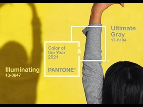
In speaking of the 2021 color of the year Leatrice Eiseman, the executive director of the Pantone Color Institute said this:
“The union of enduring Ultimate Grey with the vibrant yellow illuminating expresses a message of positivity supported by fortitude. Practical and rock-solid, but at the same time warming and optimistic, this is a color combination that gives us resilience and hope. We need to feel encouraged and uplifted; this is essential to the human spirit.
Leatrice Eiseman
You can watch Pantone’s inspirational video about their color of the year. It is interesting to me that some of the graphics they are using here, remind me a lot of Op Art.
Pantone’s Colors Of The Year – Ultimate Grey and Illuminating
There is a lot of psychology behind why Pantone has chosen these two colors. One reason is that Ultimate gray is thought to be a dependable color meaning it is a color that most people are familiar with. I know my Apple Mac Pro Laptop’s color looks very close o this Ultimate Gray color.
For many, 2020 has been a difficult year; many people are looking forward to doing things they have not been able to do for a long time, such as hug a friend or neighbor. For this reason, the Illuminating yellow color is vibrant and optimistic because we are looking forward with optimism for a better future.
Whatever the reason behind the color choices, there are definitely many reasons, research, and psychology into how these colors will be viewed throughout 2021. And as an artist it is important to be able to understand this because these may be many of the colours that your clients will be looking for in the artwork they purchase.
Color Reference Chart For Pantone Color for 2021
Here is a reference chart to show some of the color codes to match Pantone’s color of the year. The RGB shows how much Red, Green, and Blue are added together to make the colors.
| Reference | Ultimate Gray | Illuminating |
| Color | Gray | Yellow |
| Pantone Cotton Book (TCX) | 17-5104 TCX | 13-0647 TCX |
| RGB Color | 147 147 151 | 245 223 77 |
| Hexadecimal Color | #939597 | #F5DF4D |
| HSB Color | 52° 69% 69% | 210° 3% 59% |
This is why we feel that every artist should take notice of the Pantone colors of the year. Even if you don’t want to use the colors to incorporate them into your artwork, it is still good to understand the psychology, research, and reasoning behind the trend color choices. These trend colors will be seen throughout the coming year.
Related Questions
How Can The Procreate App Help You Become a Better Oil Painter?
There are many ways that you can use procreate to become a better oil painter. Procreate can help you set up palettes with color combinations and layout your painting before you paint it. I find it an essential tool to help me with my oil painting.
You can find out more by reading our blog How Can The Procreate App Help You Become a Better Oil Painter? by clicking here.
What Are The Different Shapes of Oil Paint Art Brushes?
There are seven basic oil paint brush shapes. Each of these shapes has different uses and will come in a variety of sizes. The basic shapes for oil paint brushes include round, flat, bright, filbert, fan, angle, MOP, and rigger.
You can learn more by reading our blog The Different Shapes of Oil Paint Art Brushes, What You Need to Know by clicking here.