If you were to close your eyes and think of the name “Vincent van Gogh,” what do you see? Chances are, it isn’t just a face with a red beard. It’s a color. Or rather, a collision of colors: the searing, almost blinding yellow of a sunflower set against a swirling, deep-midnight blue.
Vincent van Gogh revolutionized the way we perceive and use color in art. He was the great disruptor of the 19th century, taking color out of the box of “realism” and setting it free in the realm of “emotion.” Before Vincent, if you painted a tree, it was green because trees are green. After Vincent, a tree could be red, purple, or gold—not because the leaves changed, but because the artist’s heart did.
Table of Contents
- 7 Fascinating Facts About Van Gogh’s Hidden Mastery of Color
- 1. The Power Couple: Why Yellow and Blue?
- 2. Expressive Use of Color: Beyond the Camera Lens
- 3. Bold, Non-Naturalistic Choices: Heightening the Drama
- 4. Color as Symbolism: The Secret Code
- 5. The Physics of Vibration: Complementary Colors
- 6. Texture and Light: The Impasto Effect
- 7. The Legacy: Paving the Way for the Moderns
- Finding Your Own Color Language
- Deep Dive Podcast
- Related Questions

7 Fascinating Facts About Van Gogh’s Hidden Mastery of Color
Vincent van Gogh was a pioneer in using color to express deep emotion and meaning, transforming the way we perceive and experience art. From his bold, symbolic choices to his innovative techniques, his unique approach to color continues to captivate and inspire audiences around the world.
Read on as we’re going to explore the “Secret Language of Color,” using Vincent’s obsession with yellow and blue as our Rosetta Stone to understand why certain hues make us weep, laugh, or feel a strange, quiet peace.
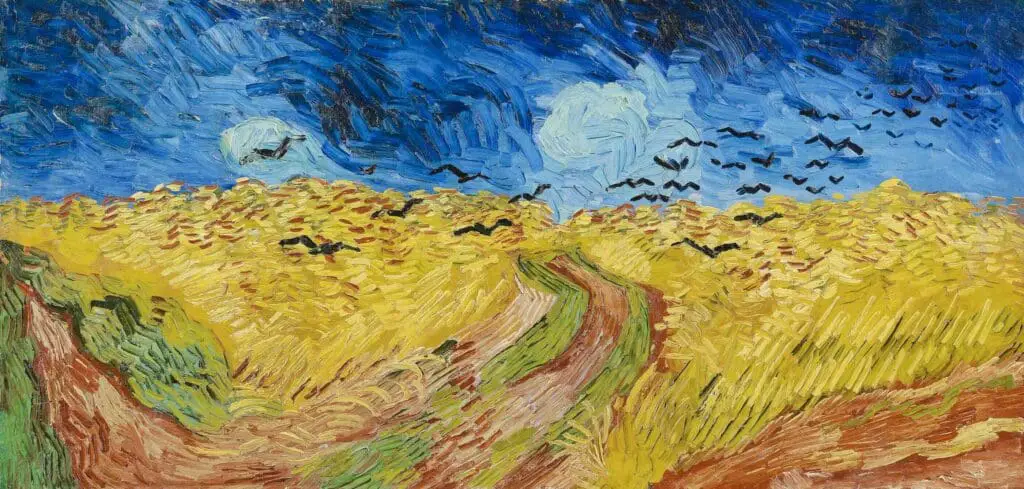
1. The Power Couple: Why Yellow and Blue?
In color theory, yellow and blue are nearly opposites. Yellow is the lightest of the primary colors, sitting at the top of the spectrum of visibility. Blue is the heavy-hitter of the cool tones, receding into the background, pulling our eyes toward the horizon.
When Van Gogh arrived in Arles in 1888, his palette exploded. He was seeking “The Studio of the South,” and he found it in the relationship between the sun and the sky.
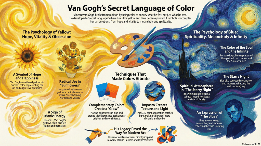
The Psychology of Yellow: Hope, Vitality, and Obsession
For Vincent, yellow wasn’t just a pigment; it was a state of grace. He used Chrome Yellow—a relatively new, bright, and slightly toxic pigment—to capture the essence of heat.
- In the Sunflowers: He used yellow-on-yellow. Yellow petals against a yellow vase on a yellow table. This was a radical move. It evokes warmth, vitality, and a sense of aggressive optimism.
- The Emotion: Yellow triggers the release of serotonin in the brain. It represents the sun, the source of all life. But in Vincent’s hands, too much yellow could also feel frantic—a visual representation of his manic energy.
The Psychology of Blue: Spirituality, Melancholy, and Infinity
If yellow was the earth and the sun, blue was the soul and the infinite.
- In The Starry Night: The swirling blues aren’t just a night sky; they are a spiritual atmosphere. Blue lowers the heart rate. It is the color of the “unreachable.”
- The Emotion: Blue represents the “Blues”—melancholy and sadness—but for Van Gogh, it was also deeply spiritual. It was the color of the cosmos, the place where he believed souls went after death.
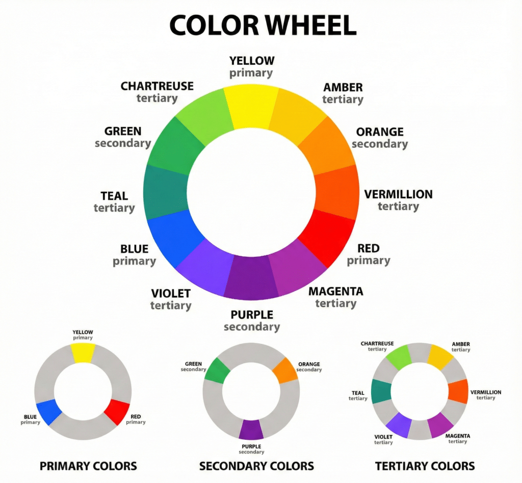
2. Expressive Use of Color: Beyond the Camera Lens
One of the greatest gifts Van Gogh gave to modern art was the permission to be “unrealistic.” At the time, photography was becoming popular, and many artists felt they had to compete with the camera by being as accurate as possible.
Vincent went the opposite way. He used color to express psychological depth.
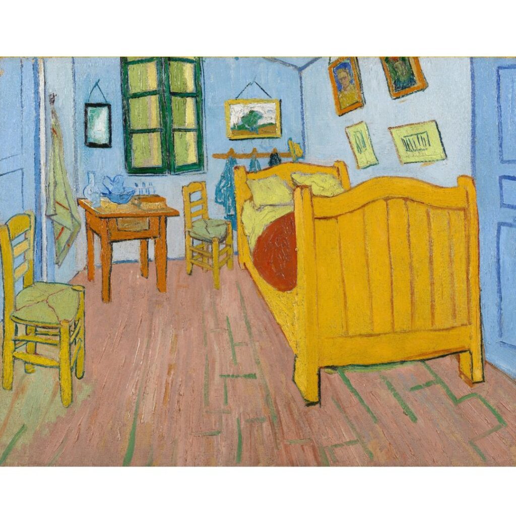
Imagine you are standing in his Bedroom in Arles. The walls are a pale violet, the floor a “fresh” red, and the wooden bed a bright yellow. None of these colors were likely that vivid in reality. Vincent used them to convey a sense of “absolute rest.” He wanted the colors to tell you how to feel before you even realized what you were looking at.
This was the birth of Expressionism. He proved that an artist’s job isn’t to show you what a room looks like, but what it feels like to live in it.
3. Bold, Non-Naturalistic Choices: Heightening the Drama
Van Gogh was a master of the “exaggeration.” If a sunset was beautiful, he didn’t just paint it orange; he painted it in screaming, vibrant streaks of vermilion and gold that looked like the sky was on fire.
In his Sower with Setting Sun, the sun is a massive, glowing lemon-yellow disc that dominates the composition. The ground is a vibrant violet. By defying traditional norms, he forces the viewer to pay attention. You can’t look at a Van Gogh and be bored. The colors are too loud to be ignored.
This bold approach was a rejection of the “muddiness” of traditional academic painting. Vincent wanted his colors to be “pure.” He often squeezed paint directly from the tube onto the canvas, ensuring that the vibrancy was never lost in the mixing process.

Portrait (Van Gogh), 1985
4. Color as Symbolism: The Secret Code
To Vincent, color was a tool for symbolic meaning. He wrote extensively to his brother, Theo, about what colors meant to him.
- Yellow = Happiness and Hope: This was his “sacred” color. When he was happy, he painted in gold.
- Blue = The Divine and the Melancholy: It was the color of the workers, the peasants, and the vast, uncaring sky.
- Red and Green = The “Terrible Passions”: In his painting The Night Café, he used a clash of red walls and a green ceiling to express the idea that “one can ruin oneself, go mad, or commit a crime” in such a place.
By understanding this code, we realize that Vincent was speaking to us. He was using color to communicate complex ideas about the human condition without needing a single word.

5. The Physics of Vibration: Complementary Colors
Why do Van Gogh’s paintings seem to “glow” or vibrate on the wall? It’s not magic; it’s physics.
Vincent was heavily influenced by The Law of Simultaneous Contrast, a theory popularized by Eugène Delacroix. The theory states that if you place two complementary colors (opposites on the color wheel) next to each other, they will make each other appear brighter.
- Yellow and Purple
- Blue and Orange
- Red and Green
In Café Terrace at Night, look at the warm, glowing yellow of the café interior against the deep, star-studded blue of the street. Because they are opposites, the yellow looks more “yellow” and the blue looks more “blue.” They vibrate against one another, creating a visual hum that makes the painting feel alive.
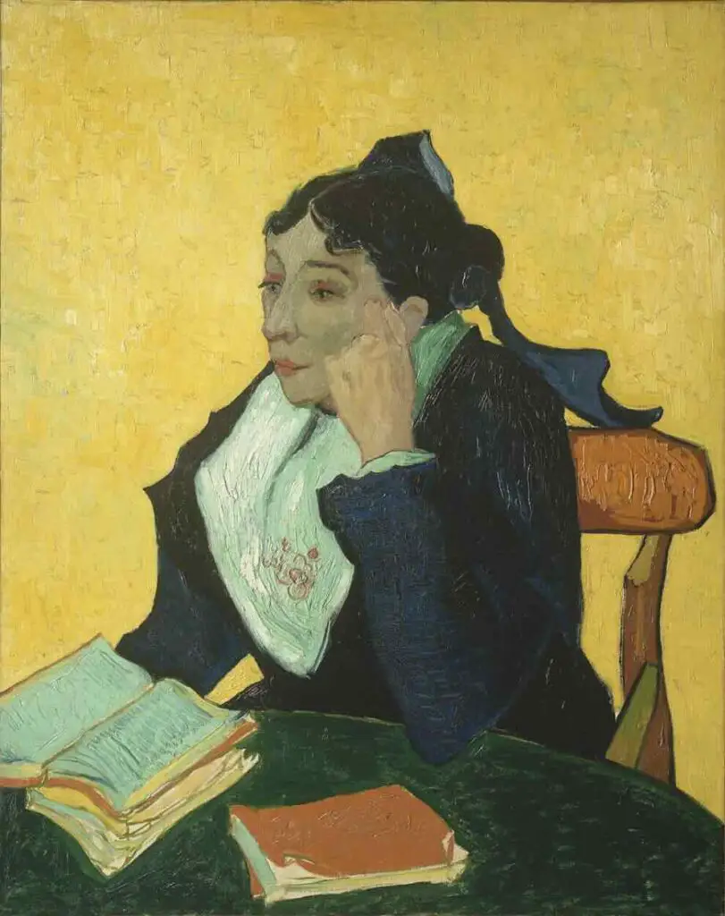
6. Texture and Light: The Impasto Effect
We cannot talk about Van Gogh’s color without talking about his Impasto—the thick, sculptural application of paint.
When you apply paint as thickly as Vincent did, the paint itself becomes a 3D object. It catches the light of the room, creating tiny shadows within the brushstrokes. This makes the colors appear more vivid and tactile.
The color isn’t just sitting on the surface; it is moving. In his wheatfields, the thick yellow strokes follow the direction of the wind, making the color feel dynamic. You don’t just see the color; you feel the energy that went into placing it there.
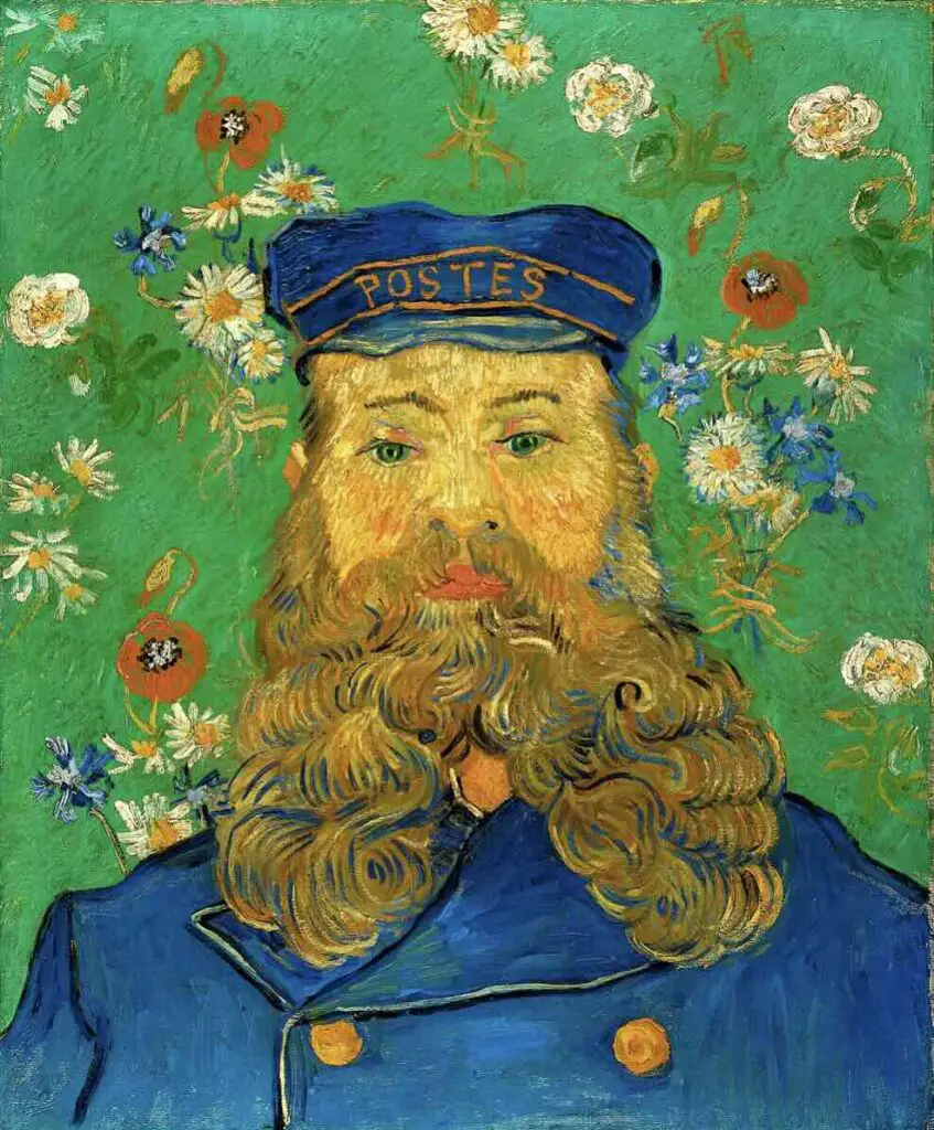
7. The Legacy: Paving the Way for the Moderns
Van Gogh’s “Secret Language” didn’t die with him in 1890. It became the foundation for almost everything that followed in the 20th century.
- The Fauves (The “Wild Beasts”): Artists like Henri Matisse took Vincent’s non-naturalistic color even further. They painted blue faces and green skies, fully embracing the idea that color is an emotional choice, not a logical one.
- The Expressionists: Artists like Edvard Munch (creator of The Scream) used Vincent’s symbolic color language to explore the darker side of the human psyche—anxiety, fear, and loneliness.
Every time you see a modern logo, a vibrant movie poster, or a contemporary painting that uses bold, “clashing” colors to make a point, you are seeing the ghost of Vincent van Gogh.
Finding Your Own Color Language
Vincent van Gogh transformed color into a window into the soul. He taught us that we don’t have to accept the world as it appears; we can interpret it through the lens of our own emotions.
The next time you are out for a walk and you see a bright yellow dandelion against a grey sidewalk, or a deep blue shadow on a white wall, take a moment to ask yourself: How does this color make me feel? Color is a secret language we all speak, whether we realize it or not. Vincent just happened to be the one who shouted it the loudest.
Deep Dive Podcast
Check out our Deep Dive Podcast
Anita Louise Art is dedicated to art education, great artists, and inspiring others to find and create their art. We love art that uplifts and inspires. #ArtToMakeYouSmile! #ArtToMakeYouHappy!
If you want to see any of my art, you can find out more by clicking here. If you are interested in what inspires me and my paintings, you can discover more by clicking here.
We have a free newsletter and would love you to be part of our community; you can subscribe to the newsletter by clicking here. If you have any questions, I would be happy to talk to you anytime. You can reach me, Anita, by clicking here.
Subscribe to our Anita Louise Art YouTube Channel with great videos and information by clicking here.
Join us for our podcast “5 Minutes With Art or Deep Dive with 5 Minutes With Art” Spend just a few minutes a week with us to discover and learn about great art and artists. You can find out more about our podcast by clicking here.
Related Questions
Pulling Back the Curtain: Women Artists of the Baroque Era Who Shattered Conventions
The names Caravaggio, Bernini, and Rubens dominate the narrative, celebrated as the geniuses who defined one of art’s most theatrical and emotive periods. But what if that picture is incomplete? What if, hidden behind the shadows of these towering figures, there were women whose contributions were equally groundbreaking yet overlooked by history?
You can read Pulling Back the Curtain: Women Artists of the Baroque Era Who Shattered Conventions by clicking here.
Where Did The Renaissance Begin? Why It Was Essential
The Renaissance began in Florence, Italy in the 14th Century. Florence was essential for the Renaissance because of its location, wealth, and many other factors. As we explore the Renaissance and Florence, this vital movement started.
You can read more by reading our blog, Where Did The Renaissance Begin? Why It Was Essential by clicking here.
Italy – Renaissance Art Defined And Explored
Originating in Florence, Italy, the Italian Renaissance is pivotal in shaping this transformative era, laying the artistic foundations we continue to admire today. Celebrated for its revival of classical ideals and introduction of innovative artistic techniques, the period also stands as a staunch advocate of humanistic values. Join us as we delve deeper into this fascinating Italian Renaissance art history chapter.
By clicking here, you can discover more by reading Italy – Renaissance Art Defined And Explored.

Leave a Reply
You must be logged in to post a comment.