
Color, an integral part of our daily lives, is a powerful communication tool that influences our emotions and actions without realizing it. Different colors evoke various feelings and emotional responses in people, contributing significantly to our perception of the world around us. This essay delves into one particular emotion — sadness, examining its correlation with color from diverse perspectives: psychological, historical, cultural, and contemporary art.
The varied hues of blue, grey, and other colors conventionally associated with sadness have more to them than what meets the eye. Over the centuries, artists have adroitly used this concept to their advantage, manipulating colors to enhance the emotional depth of their art. The essay navigates this fascinating intersection of color, emotion, and art, unearthing intriguing insights that make us view colors in a new light.
Table of Contents
- The Psychology of Colors: Sadness and Beyond
- Historical Use of Colors Depicting Sadness
- Colors of Sadness in Various Cultures
- Related Questions
The Psychology of Colors: Sadness and Beyond
The enchanting world of art is an expression of creativity and the visual representation of intricate human emotions. Of the many elements that create an artwork, color holds precedence. It is predominantly the element that people notice first, and it resonates with our inner selves’ vibrations, echoing our emotions and psyches. Among the myriad shades an artist can coat their canvass, the hues associated with sadness offer a particularly captivating study.
The profound impact of color on human psychology has been acknowledged since antiquity. Every color elicits specific emotional responses, psychic behavior, and mood changes, collectively known as color psychology. The effect of colors on mood finds comprehensive expression in the arts and has inspired a wide range of artistic styles and movements.
Colors linked to sadness are usually cooler tones like blue, purple, and gray. These colors carry an inherent melancholy originating in observed and sociological associations as expressions of the natural world and human behaviors. They also carry the symbolism imbibed into them by different cultures worldwide.
It is no coincidence that ‘feeling blue’ is a universally accepted term for sadness or depression. Blue is a symbolic color that, despite being associated with calmness and serenity, also mirrors solitude, melancholy, and vulnerability. It is the color of the sky in twilight and the expansive ocean, both vistas that evoke a certain pensiveness or contemplation.
Art has leveraged this essence to evoke and explore emotional depths via shades of blue. From Picasso’s stark, poignant blue period to Robin Egg’s soothing blue found in Mark Rothko’s works, sadness’s visualization is potent and profound.
Purple is another shade often associated with sorrow, occupying a spectrum between blue and red. Its darker tones, calling to mind bruising, are synonymous with suffering and distress. Though traditionally linked with royalty, it is also the liturgical color for mourning. Artists since the early Renaissance have employed dark shades of purple to project pain and suffering, subtly hinting at sorrow.
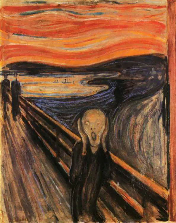
Grey, as the halfway point between absolute darkness and light, often signifies neutrality or emptiness, both emotions linked to sadness. It is a fundamental color in human consciousness due to its ubiquity, from ash to concrete, from aging hair to gloomy days. Edvard Munch’s “The Scream” uses grey expanses to build a sense of desolation, emphasizing the figure’s existential angst.
How the human brain perceives these sadness-infused colors is a fascinating exploration. Psychologists report that when an individual views an artwork imbued with these colors, their brain activity adjusts accordingly.
It causes the viewer to mirror the emotions portrayed in the artwork, such as sadness, grief, or melancholy, hence why viewers may feel a sense of sorrow in front of such artworks.
Through understanding the nuanced relationship between color and emotion, artists can use their palette to delve deeper into our emotional spectrums. At the same time, viewers, on the other hand, can interpret art through a more empathetic lens. In an extraordinary, subtle, and personal way, art’s colors coalesce with psychology, generating profound emotional landscapes that directly speak to our hearts.
This symbiosis between art and psychology is instrumental in stirring rich, thought-provoking conversations about human emotions, especially the more complex and poignant ones like sadness.
Historical Use of Colors Depicting Sadness
Delving further into our exploration of the artistic use of colors to represent sadness, it is essential to spotlight how artists have manipulated the intensity and saturation of certain hues to sculpt their narrative.
As layered and intricate as human emotions, the delicate play of sadness on the artist’s palette extends beyond monochromatic blues and purples. Instead, it delves into the labyrinth of tonalities and shades that reflect our multifaceted experiences of sorrow.
Consider the use of desaturated or muted colors. While a bright, vibrant red might typically be associated with passion and anger, a subdued, washed-out variation radiates a feeling of melancholy. The art world reverently refers to this as “unsaturated sadness,” where paleness and dullness augment the viewer’s emotional perception.
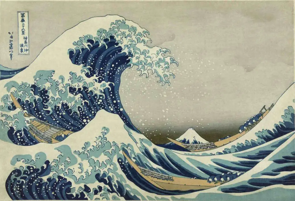
In his series “Thirty-Six Views of Mount Fuji,” Japanese artist Hokusai demonstrated the profound impact of desaturation by employing low-intensity, pale colors to communicate the despairing serenity and solitude of the human condition.
Artists have also ingeniously employed color contrasts, particularly between warm and cool shades, to visualize sorrow. By juxtaposing vibrant, warm colors with cold, muted hues, artists have often amplified the loneliness and isolation associated with sadness.
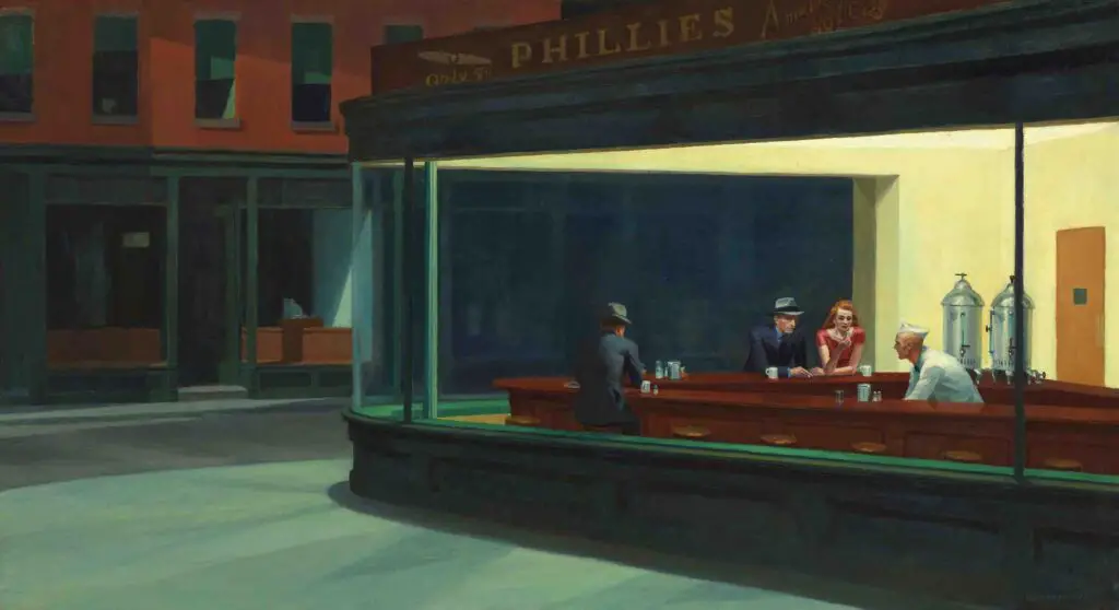
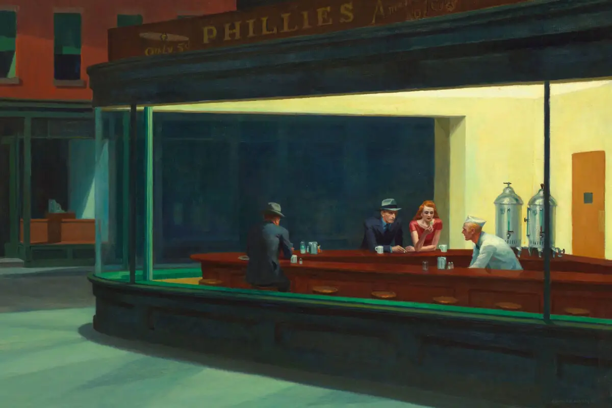
For instance, in Edward Hopper’s iconic painting “Nighthawks,” the bright, warm lights inside the diner starkly contrast with the incredible, lonely emptiness of the street. This clever interplay enhances the feelings of sadness, evoking a palpable sense of melancholy urban solitude.
Deep, shadowy blacks and grays have traditionally been vital allies of artists in depicting sadness. Darkness often goes hand in hand with sorrow, and the strategic application of dark colors has allowed painters to illustrate their themes of melancholy and despair effectively.
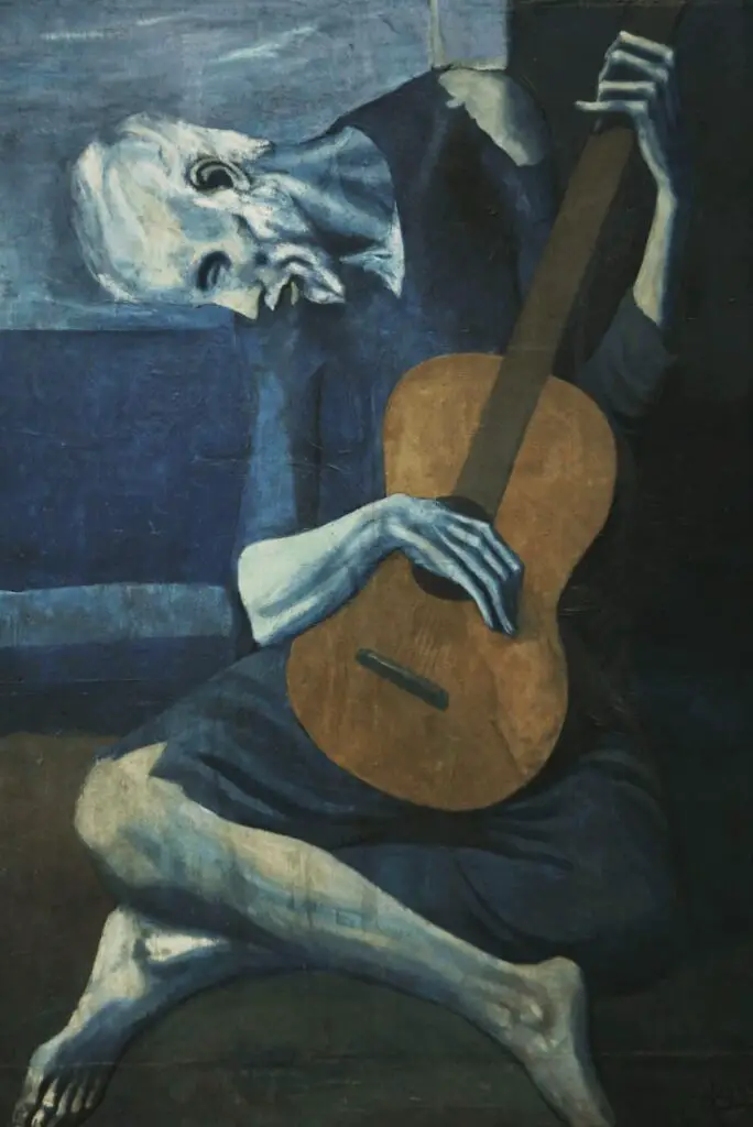
During his famous “Blue Period,” Pablo Picasso used dark shades alongside more excellent colors, painting his subjects’ internal plight against societal hardship and poverty.
Artists also habitually employ color harmony to create an atmosphere of sadness. A monochromatic scheme (the use of variances in lightness and saturation of a single color) or an analogous scheme (the use of colors that are adjacent to each other on the color wheel), when carefully wielded in the proper context, can enhance the intensity of the sad emotion.
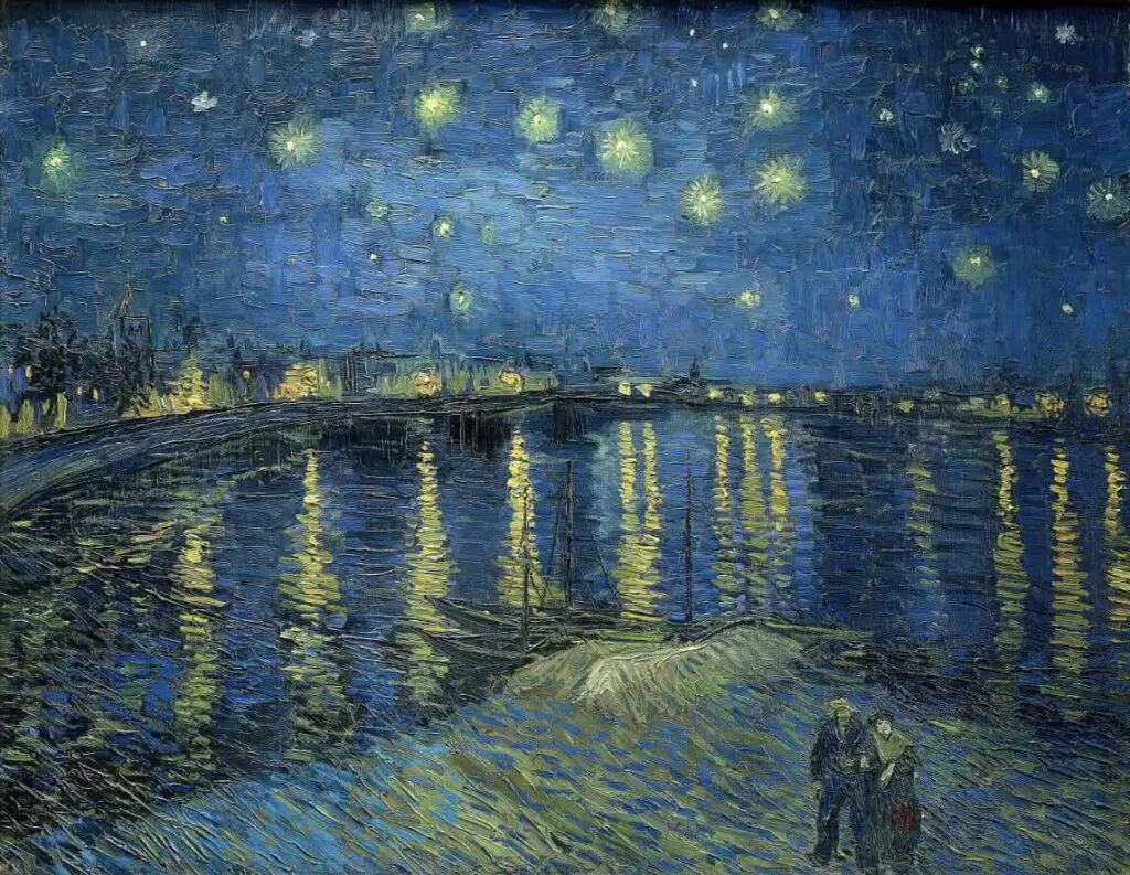
A testament to this is Vincent van Gogh’s “Starry Night over the Rhone.” Despite using primarily blues and violets (purportedly calming colors), the painting could easily invoke a sense of longing and melancholy due to the artist’s arrangement of these colors.
Artistic representation of sadness transcends the mere use of color; it touches on their arrangement, saturation, contrast, and layering. Artists have creatively mastered this psychological color palette to exhibit their work and offer a journey that discloses the hues of human emotion, the complexity of sadness, and the compelling discourse between art, the psyche, and human experiences.
Colors of Sadness in Various Cultures
As we traverse the depths of understanding color and its implication in art, it is crucial to decipher how different cultures perceive and communicate their melancholy like a silent whisper through the interplay of color.
While it is established that blue, purple, and gray are the standard satiety of sorrow, the cross-cultural perspective paints a comprehensive palette. Unraveling this spectrum, one would establish that cultures transform and narrate their cogitation of emotions, especially sadness, in surprisingly ingenious ways.
In an exciting contrast, several cultures associate sadness with colors profoundly different from the blues and greys commonly associated with sorrow in various societies. For instance, within the realm of Chinese culture, white holds a distinctive association with mourning and sadness.
Similarly, the Egyptian civilization traditionally associates yellow with mourning and despair. The ancient Egyptian belief that gold, a material element related to the color yellow, is a divine and indestructible element led to it being associated with mortality and, hence, real grief over the death cycle.
This can be seen in the stunning gold masks and sarcophagi from Ancient Egypt, representations of death yet infused with a divine luster.
Contrastingly, in Latin American cultures, the skeletons and skulls commonly associated with death and sadness are often painted in bright, joyful colors during the Day of the Dead celebrations. This comprehensive use of vibrant colors like red, pink, green, and more transcends the usual perception of sadness and evokes a more profound sense of respect and remembrance for the deceased.
When navigating the domain of modern art cultures, the Japanese aesthetic of Mono no Aware embraces the transient nature of life. It evokes a gentle sadness through soft pastels and desaturated colors. Thianime is highly prevalent in Anime culture, reflecting a solid art and cultural art towards perceiving and expressing sorrow.
Exploring the African artistic realm reveals another dimension to interpreting sadness through colors. The vibrant, psychedelic colors against dark themes and subjects in many contemporary African art forms are a stark departure from the traditional, more fabulous shades.

Despite its vibrant cover, Achebe’s “Things Fall Apart” conveys Okonkwo’s tragic fall, blending and mending colors with emotions in a unique, culturally influenced manner.
To dive into the heart of understanding art is to realize that the perception of color and its emotional connotations is a vast kaleidoscope, constantly shifting its patterns with differing cultural contexts.
Every culture offers its distinct hue of sadness, each subtly different in its density, each narrating a story subtly and profoundly, reflecting the wonderfully diverse human experience. This diversity enriches the world of art, enabling it to continue its endless conversation about the human emotional experience.
After traversing through the multifaceted panorama of colors and emotions, we have seen that the associations between colors and sadness are more than mere societal constructs.
They have developed and evolved through centuries, influenced by psychological interpretations, historical events, cultural practices, and artistic explorations. Colors have a universal language that transcends time and cultural barriers, evoking emotions that speak to the shared human experience.
The profound role of colors in expressing sadness, as seen in historical and contemporary art, underscores the potency of this seemingly trivial aspect of our lives. Indeed, the colors we encounter daily profoundly impact our emotions and understanding of the world, profoundly impact our emotions and acknowledge.
Anita Louise Art is dedicated to art education, great artists, and inspiring others to find and create their art. We love art that uplifts and inspires. #ArtToMakeYouSmile! #ArtToMakeYouHappy!
If you want to see any of my art, you can find out more by clicking here. If you are interested in what inspires me and my paintings, you can discover more by clicking here.
We have a free newsletter and would love you to be part of our community; you can subscribe to the newsletter by clicking here. I would be happy to talk to you if you have any questions. You can reach me, Anita, by clicking here.
Subscribe to our Anita Louise Art YouTube Channel with great videos and information by clicking here.
Join us for our podcast “5 Minutes With Art.” Spend just 5 minutes a week with us to discover and learn about great art and artists. You can find out more about our podcast by clicking here.
Related Questions
Francisco Goya’s Black Paintings: A Descent Into Darkness
The art world has witnessed a multitude of masterpieces, but few are as enigmatic and intensely personal as Francisco Goya’s Black Paintings. Perhaps no other paintings than the series of black paintings show the mind of Francisco Goya and what he was going through.
By clicking here, you can learn more by reading Francisco Goya’s Black Paintings: A Descent Into Darkness.
Guide To Frida Kahlo Self-Portraits Paintings And Why They Are Important
Frida Kahlo’s self-portraits give us a unique look and understanding of her life, suffering, resilience, and inner strength. The self-portraits show her physical and psychological torture. Frida Kahlo’’s self-portraits created both powerful and beautiful artworks. Frida Kahlo and her self-portraits left us with a timeless legacy of strength and courage.
You can discover more by reading Guide To Frida Kahlo Self-Portraits Paintings And Why They Are Important by clicking here.
What Was The Reason For Van Gogh’s Sadness?
You are never too old to learn to oil paint. You can start to oil paint at any age. If Grandma Moses could learn to paint at age 78, she set an example for us all – that you are never too old to learn to paint. There are some advantages to learning to paint when you are older vs. younger.
By clicking here, you can discover more by reading What Was The Reason For Van Gogh’s Sadness?