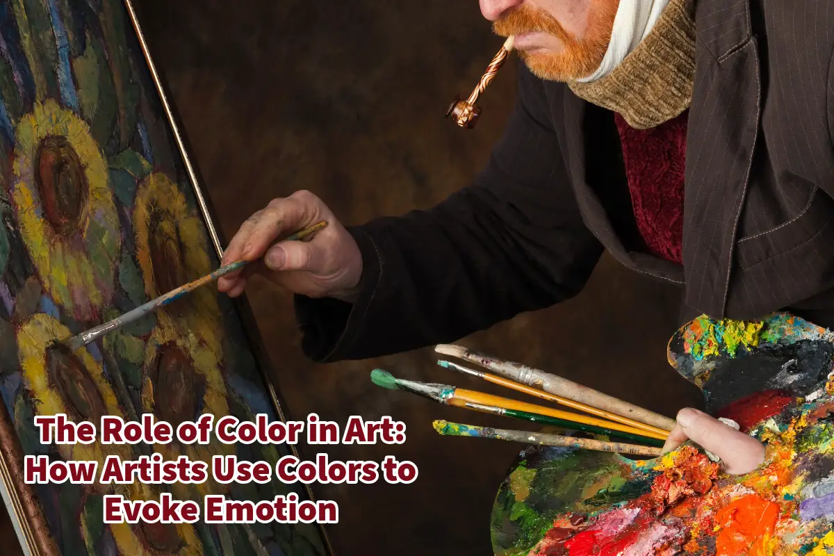
Color is one of the most powerful tools an artist can use to communicate emotions, ideas, and narratives in visual art.
Through the careful application of color theory, artists can create mood, meaning, and impact in their works, guiding the viewer’s emotional response and perception. Whether using warm or cool colors, complementary contrasts, or symbolic hues, artists have long understood the psychological and cultural significance of color in shaping an artwork’s overall effect.
Table of Contents
- The Psychology of Color in Art
- The Principles of Color Theory in Art
- Van Gogh: A Master of Color
- Examples of Van Gogh’s Use of Color
- Related Questions
Read on as we will explore how color influences emotions in art, the principles of color theory, and how different hues elicit specific psychological responses.
Additionally, we will look closer at one of the masters of color in art: Vincent van Gogh. By examining his use of color, we will see how he harnessed this powerful element to convey deep emotion and meaning in his paintings.
The Psychology of Color in Art
Artists and designers have long studied color psychology to understand how different hues can affect human emotions. While individual responses to color can vary based on personal experiences and cultural background, specific universal associations exist.
Here are some common emotional responses to colors:
- Red – Often associated with passion, energy, love, and danger. Red can create a sense of urgency or intensity.
- Blue – Evokes calmness, stability, and serenity. Darker blues can represent melancholy, while lighter blues symbolize peace and tranquility.
- Yellow – Represents happiness, warmth, and optimism. However, too much yellow can cause agitation or anxiety.
- Green – Linked to nature, growth, and renewal. Green often symbolizes health, balance, and prosperity.
- Purple – Associated with luxury, creativity, and spirituality. Lighter purples evoke a sense of nostalgia, while deeper purples can feel mysterious.
- Black symbolizes sophistication, elegance, mystery, or darkness. It is often used to create contrast and depth.
- White – Represents purity, simplicity, and peace. In some cultures, it is also associated with mourning.
By selecting and combining colors with intention, artists can evoke specific emotions and guide the viewer’s experience of their work.
The Principles of Color Theory in Art
Color theory is a fundamental concept in art that guides how artists use color to achieve harmony and emotional impact. Here are some of the core principles:
1. The Color Wheel
The color wheel is a tool used to understand color relationships. It consists of:
- Primary colors: Red, blue, and yellow – the building blocks of all other colors.
- Secondary colors: Orange, green, and purple are created by mixing two primary colors.
- Tertiary colors: Combinations of primary and secondary colors, such as red-orange or blue-green.
2. Color Schemes and Harmonies
Artists use various color schemes to create different visual effects:
- Complementary Colors: Colors opposite each other on the color wheel (e.g., red and green) create contrast and vibrancy.
- Analogous Colors: Colors next to each other on the wheel (e.g., blue, green, and yellow) create a harmonious and calming effect.
- Triadic Colors: Three evenly spaced colors on the wheel (e.g., red, yellow, and blue) create a balanced and dynamic look.
- Monochromatic Colors: Variations of a single hue using different tints and shades to create depth and unity.
3. Warm vs. Cool Colors
- Warm colors (reds, oranges, yellows) create energy, passion, and excitement.
- Cool colors (blues, greens, purples) evoke calmness, relaxation, and introspection.
By mastering these principles, artists can strategically use color to guide the viewer’s emotional and psychological engagement with their work.
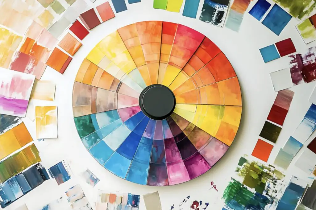
Van Gogh: A Master of Color
Vincent van Gogh is regarded as one of the greatest colorists in art history. His ability to use bold, expressive colors to convey emotion has impacted the art world. Van Gogh’s approach to color was deeply personal, using it to express his inner struggles, joys, and perceptions of the world around him.
Van Gogh’s Use of Color to Evoke Emotion
Van Gogh’s use of color was revolutionary. He moved away from naturalistic color palettes and used expressive, exaggerated hues to convey emotion. His color choices were often symbolic and deeply tied to his state of mind. Here are a few key ways he used color:
- Contrast and Intensity – Van Gogh often used complementary colors to create dramatic contrasts, such as blue and orange in The Café Terrace at Night.
- Symbolic Meaning – He associated different colors with emotional states. For example, he used bright yellows to signify warmth and hope, as seen in Sunflowers.
- Mood and Atmosphere – His shift from bright, lively colors to dark, moody palettes reflected his mental health struggles. For instance, The Starry Night has swirling blues and yellows that evoke turbulence and tranquility.
Examples of Van Gogh’s Use of Color
Here are some top examples of Vincent Van Gogh’s works of art and how color is used in these paintings to create emotion.
1. The Starry Night (1889)
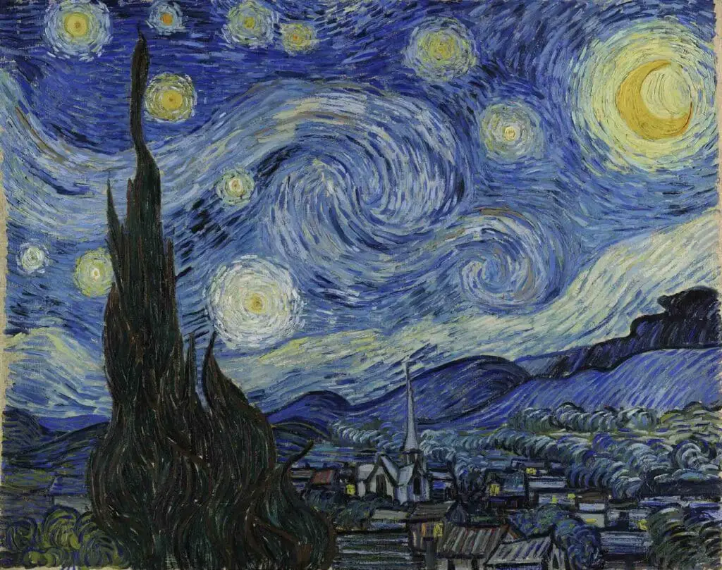
One of Van Gogh’s most famous paintings, The Starry Night, uses a swirling night sky filled with blues and yellows. The contrast between the deep blues and glowing yellows creates a dreamlike, emotional atmosphere. The color choices evoke feelings of wonder, isolation, and longing.
2. Sunflowers (1888-1889)
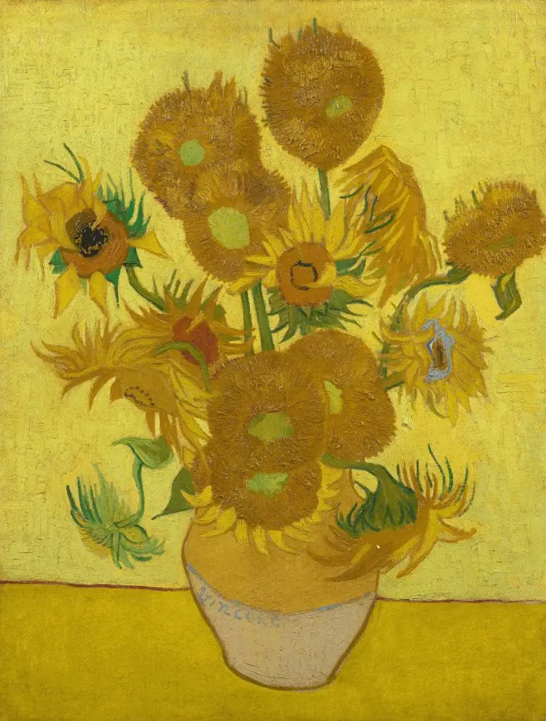
Van Gogh’s Sunflowers series is dominated by yellows and oranges, symbolizing warmth, happiness, and admiration. He used different shades of yellow to bring energy and optimism to the painting, reflecting his appreciation for life and nature.
3. Café Terrace At Night (1888)
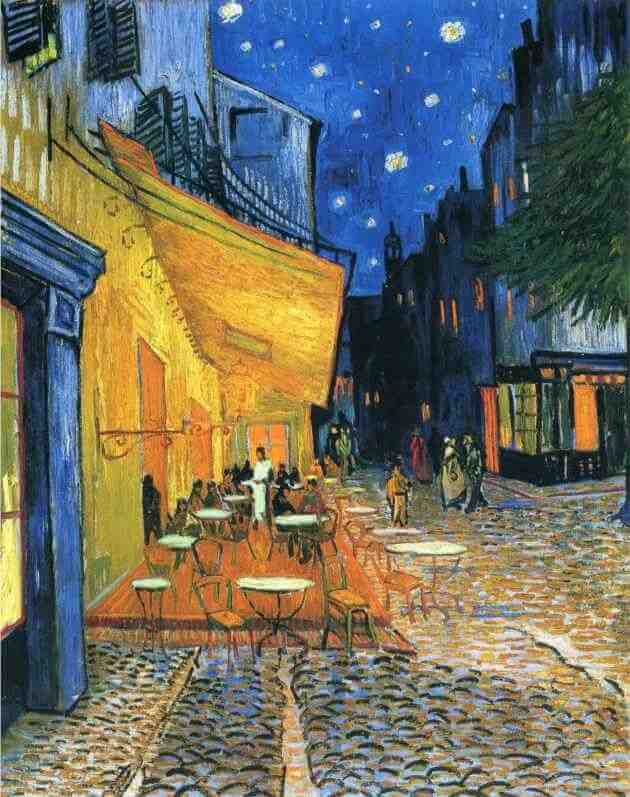
In Café Terrace At Night, Van Gogh used harsh red and green contrasts to create a sense of unease and tension. The bold, unnatural colors reflect the chaotic and melancholic mood of the scene, showing how colors can be unsettling when used in a certain way.
4. Wheatfield with Crows (1890)
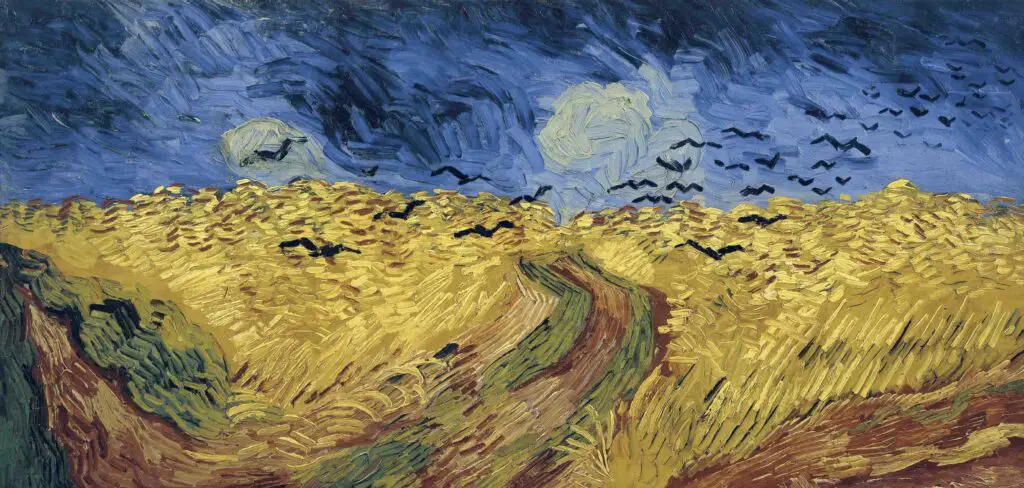
One of his final paintings, Wheatfield with Crows, features a dark, stormy sky filled with deep blues and blacks contrasted with golden wheat fields. This intense color contrast contributes to the painting’s dramatic and foreboding atmosphere, possibly reflecting his emotional turmoil.
Color plays an essential role in the emotional impact of art. Through the principles of color theory, artists manipulate hues to evoke specific emotions and create meaningful compositions.
One of the greatest masters of color, Vincent van Gogh, used bold, expressive hues to communicate his emotional state and bring his paintings to life. His ability to harness color to convey mood, meaning, and impact continues to inspire artists and viewers alike.
Understanding the power of color in art allows us to better appreciate the depth and intention behind artistic creations.
Whether through the vibrant yellows of Sunflowers, The Starry Night’s dreamy blues, or The Night Café’s unsettling contrasts, Van Gogh’s genius with color remains a testament to how this fundamental element can evoke deep, lasting emotions in art.
Great paintings and artists like Van Gogh inspire me. Anita Louise Art is dedicated to art education, great artists, and inspiring others to find and create their art. We love art that uplifts and inspires. #ArtToMakeYouSmile! #ArtToMakeYouHappy!
Listen To Our Podcast About How Do Artists Use Color to Create Emotion in Their Work?
Below or By clicking here.
Anita Louise Art is dedicated to art education, great artists, and inspiring others to find and create their art. We love art that uplifts and inspires. #ArtToMakeYouSmile! #ArtToMakeYouHappy!
If you are interested in seeing any of my art, you can find out more by clicking here. If you are interested in what inspires me and my paintings, you can discover more by clicking here.
We have a free newsletter and would love you to be part of our community; you can subscribe to the newsletter by clicking here. I would be happy to talk to you if you have any questions. You can reach me, Anita, by clicking here.
Subscribe to our Anita Louise Art YouTube Channel filled with great videos and information by clicking here.
Join us for our podcast “5 Minutes With Art.” Spend just 5 minutes a week with us to discover and learn about great art and artists. You can find out more about our podcast by clicking here.
Related Questions
What Was The Impact Of Vincent Van Gogh On The Art World?
Van Gogh used color, form, and emotions in his art. He had a bright palette that was individualized for his time. Even though he did not see a lot of success during his life after he died, the impact of his art can be seen in both the Expressionism and Fauvism movements that were taking place in Europe.
By clicking here, you can learn more by reading What Was The Impact Of Vincent Van Gogh On The Art World?
Why Is Van Gogh Considered Such a Great Artist?
Many things make Vincent Van Gogh unique and great as an artist. He had a great way to use color in his heart, but more than that, he was an artist who set and paved the way, and his brushstroke technique used color and his design ability. What is interesting about all this he did this as a self-taught artist.
By clicking here, you can discover more by reading Why Is Van Gogh Considered Such a Great Artist?
How Did Vincent van Gogh’s Paintings Become Famous?
Vincent van Gogh’s painting became famous because his sister-in-law took her upon herself after his death and the death of her husband Theo to find a way to get his paintings and names out to the world. She was brilliant and savvy in how she did this. By the time she had died in 1925, Vicent van Gogh was world renown.
By clicking here, you can learn more by reading What Was The Impact Of VinHow Did Vincent van Gogh’s Paintings Become Famous?