Red has captivated human imagination throughout history, from the fiery hues of a setting sun to the bold presence on a painter’s palette. This exploration into the rich world of Red reveals its dynamic role in art—tracing its roots back to prehistoric times and coursing through the veins of modern masterpieces.
We’ll unravel the diverse ways red has been deployed by artists across the ages, observing its cultural significance, emotional resonance, and ever-evolving aesthetics. Prepare to embark on a chromatic journey through the historical use of red in art, where we uncover its complementary and analogous allies and delve into the intricacies of color theory as it pertains to this most passionate pigment.
Table of Contents
- Historical Use of Red in Art
- Analogous and Monochromatic Schemes
- Cultural and Emotional Influences
- Contemporary and Experimental Uses
- Related Questions
Historical Use of Red in Art
Red, a hue steeped in significance, carries a history as rich and varied as the scope of the human condition it often depicts. To master its potential in the art realm, one must understand its past and how to weave it harmoniously within the palette of the present.
Regarding color complementation, red finds its counterparts across the color wheel, with green, orange, and purple offering striking juxtapositions that create visual harmony and intrigue.
Complemented with Red on the color wheel, green evokes a feeling of balance when paired with its vibrant opposite. This natural contrast is no mere coincidence; in nature, the Red of roses against the green of their leaves is a testament to the aesthetic pleasure derived from these opposites.
In fine art, the juxtaposition of red and green has been manipulated to capture the viewer’s eye, commanding their attention and highlighting subjects with captivating depth. When utilized skillfully and subtly, the red-green dichotomy can achieve a dynamic equilibrium, freeing the artwork from any risk of visual monotony.
While adjacent to red, orange provides a warm composition when they meet on a canvas. This amalgamation of hues resonates with the brilliance of a sunset, where the reds and oranges merge in a harmonious display of light and warmth.
Artists have long harnessed this pairing to generate a sense of vitality and enthusiasm. Whether through delicate brush strokes or bold abstract forms, the marriage of red and orange exudes an energy that is both vibrant and inviting.
Purple, or violet, holds its unique space on the color wheel, where it meets red and blue. When red encounters purple, the result is akin to that of royalty and luxury—a connection embedded within our cultural psyche.
Historically, purple dyes were rare and expensive, often reserved for the garments of the elite. In art, the red-purple contrast promotes a visual richness that can deepen the narrative. The warm and cool interplay contributes to an atmosphere of mystery, making the hue combination a favorite among artists striving to invoke contemplation or regal elegance.
When paired with Red, these complementary colors have the prowess to further the dialogue between the artwork and its spectators. A red backdrop may breathe passion or aggression into a scene, while a green figure amidst such a setting could symbolize hope or a return to equilibrium.
Meanwhile, an orange highlight suggests warmth and movement, an ember within the composition, and a figure cloaked in purple might whisper secrets of sovereignty or spirituality.
The power of color in fine art transcends merely aesthetic considerations. It conjures emotional responses, directs the viewer’s gaze, and frames the narrative on the canvas.
To harness Red’s full potential, an artist’s palette need only embrace the dance of complementary colors—green for balance, orange for vibrancy, and purple for depth—each contributing to a visual harmony that resonates with the same intensity as red in art history.
Beyond the canvas, this understanding of color relationships becomes a vital tool in the overarching practice of the arts, where Red continues to blaze from heart to hand to eye, a testament to the human spirit itself.
Analogous and Monochromatic Schemes
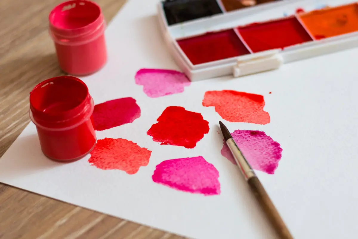
Venturing into analogous and monochromatic color schemes, where red presides as a dominant force, is akin to orchestrating a symphony of singular focus or harmonious whispers. When artists adopt monochromatic red palettes, they enter a dance with the nuances of shade, tone, and temperature.
In its purest essence, a monochromatic red scheme is steeped in the same color, navigating through its various tints and shades. This approach to color creates a visual cohesion that can soothe or startle the observer, depending mainly on the chosen hue’s saturation and brightness.
It offers an intimate exploration into the depth of a single color, red in this instance, permitting subtle differences to emerge—each bearing its own temperature and emotional weight. Through this exploration, monochromatic art strips down the conversation to a fundamental yet profound dialogue on light and form, absent of the complexities color diversity often brings.
Such canvases are often quiet yet intense, with each variation of Red, from the lightest pink to the darkest maroon, giving rise to a feeling, a memory, or a sensation. Artists exercising this control can manipulate mood and guide the viewer’s eye with an almost hypnotic command.
One swims in the many pools of a single crimson ocean, uncovering depths previously unnoticed, when red is merely a player among many on the palette.
Counter to this, analogous themes, where red aligns with its neighbors on the color wheel—typically oranges and purples—present a beautifully harmonious and satisfying harmony to the human eye.
There is an inherent energy in the vicinity of red to orange: think of a sunset’s warmth or autumn leaves. As red shifts towards purple, a royal majesty infuses the work, sumptuous and rich.
Utilizing analogous schemes permits a rhythm of visual elements to sing in a key of warmth and passion, yet never overpowering. It’s a careful balancing act; the vibrancy of Red can quickly overwhelm its companions.
Artists must calibrate these relationships with intuitiveness often honed over years of color theory practice and real-world application. These combinations, when successful, evoke sensations of coziness or exhilaration without the jarring halt a complementary scheme might introduce.
Moreover, in the context of color psychology, these approaches weave complex psychological tapestries. The singular Red of a monochromatic piece can encapsulate viewers in a cocoon that might symbolize introspection, passion, or revolution.
Alternatively, an analogous approach softens the visual impact, invoking a collective of emotions, each associated with Red’s neighboring hues, creating a blended atmosphere of excitement, creativity, and nobility.
In contemporary practice, artists delve into these schemes to evoke layered emotional states, reflect on sociocultural dynamics, and express personal narratives. Whether singularly in varying shades or blended with its neighbors, Red challenges viewers and creators alike. It’s a testament to Red’s enduring expressive power and its role in crafting visual experiences that resonate deeply within the human psyche.
Stripping away the extraneous and focusing on the essence of Red in its singular glory or its harmonic partnership with adjacent hues, art continues to reflect our complex relationships with color.
It moves beyond mere aesthetics, and through the strategic application of monochromatic and analogous schemes, red retains its place as an integral force in historical and contemporary art.
Cultural and Emotional Influences
In the ever-evolving discourse of color theory in art, the marriage of colors to enhance, contrast, or even challenge red’s visual dominance is a testament to artists’ ingenuity across epochs.
Heralded for its emotional capacity, Red finds harmony and tension when paired with various hues, underscoring cultural perceptions and invoking a rich spectrum of emotions.
For instance, the combination of red with cool blues serves as more than an exercise in color wheel dynamics. When these opposites meet on canvas, a visual vibration is birthed, embodying serenity against passion and calculation against impulse.
In cultures where blue symbolizes tranquility and the divine, positioning it alongside red evokes a narrative of conflict and resolution, mirroring the complex narratives found within human consciousness.
Similarly, juxtapositions of red with mellow yellows can stir a range of sentiments, from the warmth of a glowing ember to the agitation of a glaring sun in a bleached sky. In art, such pairings have often been employed to depict the fleeting moments of dusk or dawn, signifying transitions and the fleeting nature of time, reflections deeply rooted in the human condition.
Notably, the dichromatic relationship between red and black presents a dance of visual potency. Black, often associated with the unknown, the void, and eternity, can amplify Red’s intensity to new emotional heights. In this pairing, the spectrum of interpretations is as endless as the night sky, linking to narratives of power, eroticism, and mortality, pervasive themes in many cultural fabrications.
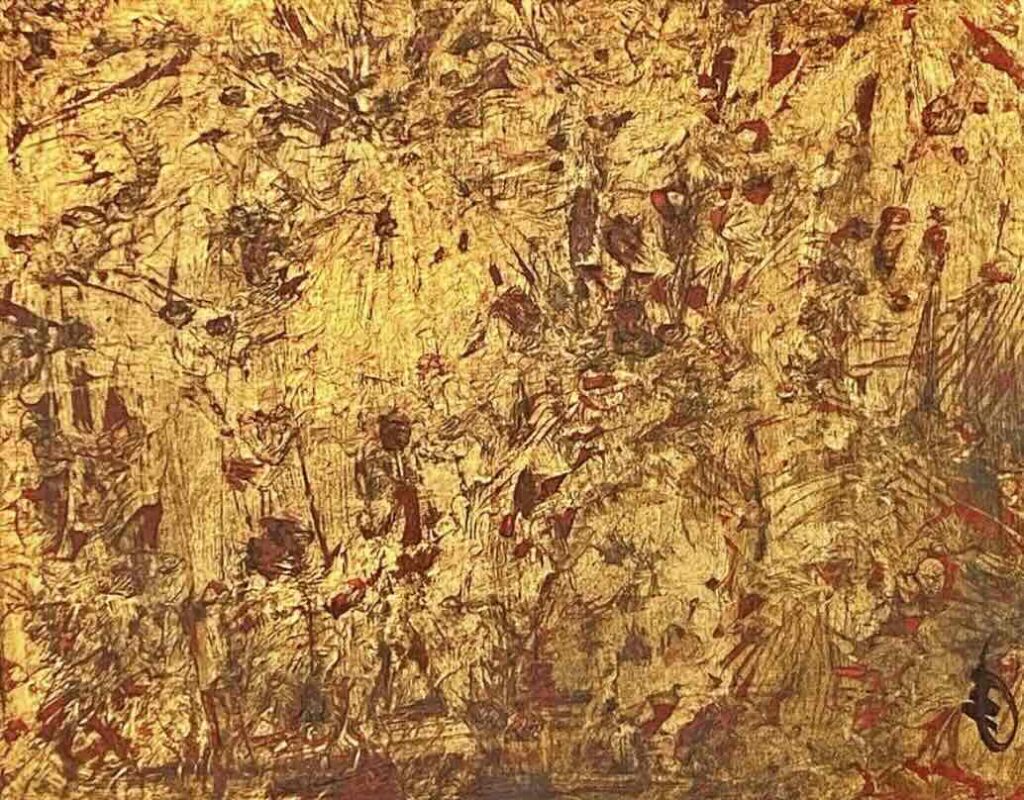
Now consider the use of Red amongst earth tones – browns and deep ochres – which carry the essence of the terrestrial world. Art that leverages this palette can exude a sense of primal energy, grounding, and stability, tapping into age-old human connections with the land and the life cycles it represents. This blending, profoundly tied to the collective ancestral memory, often evokes physical sensations, even a taste of the past.
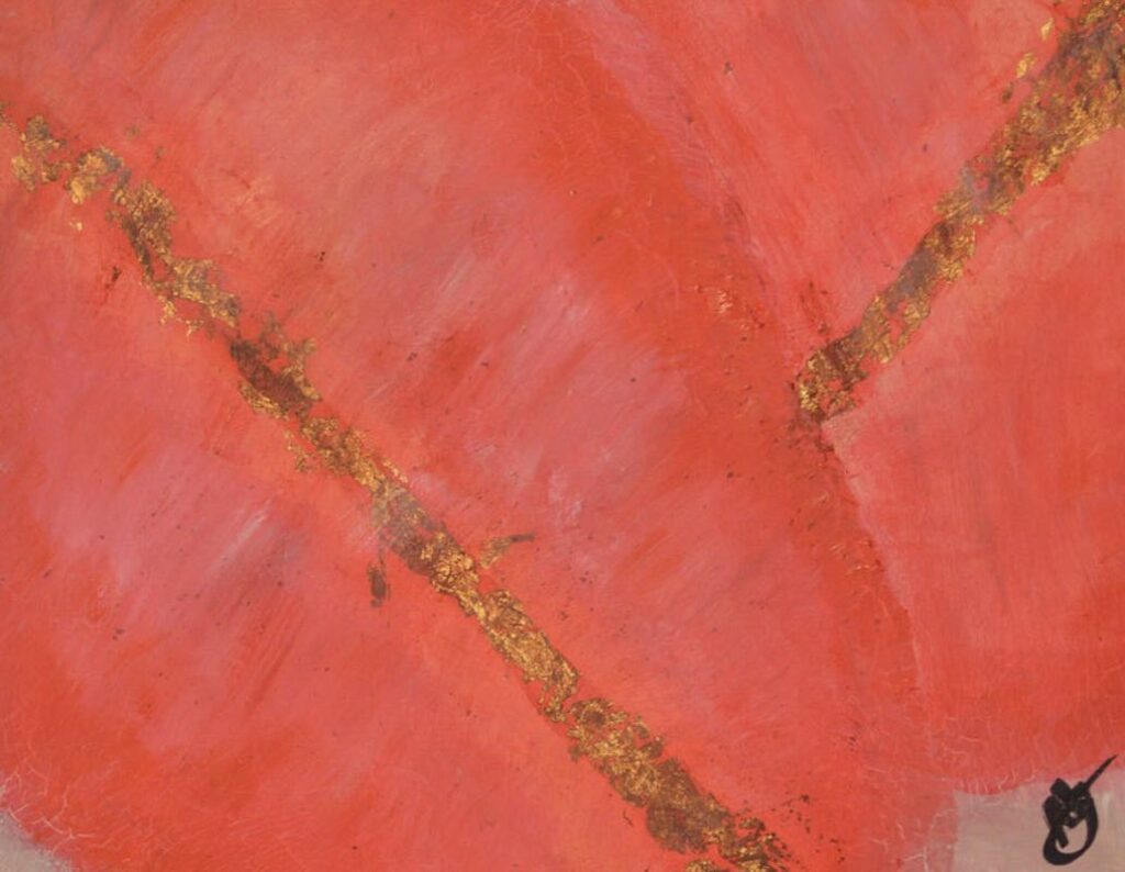
Furthermore, red’s alliance with metallic tones like silver or gold transcends mere luxury; it crafts a visual lexicon of splendor and reverence. Such combinations, omnipresent in sacred imagery and regalia, resonate deeply across cultures, invoking a connection between the material and spiritual realms that has captivated human contemplation since immemorial.
While exploring these partnerships, artists also navigate the subjective realm of color perception. Specific pairings of red may provoke joy in some viewers, while others find them disquieting, a reminder of each individual’s deeply personal relationship with color. These subjective experiences, shaped by personal histories and cultural backgrounds, are integral to the interpretive dance of art appreciation.
In this intricate waltz of colors, artists exploit the full emotional range of Red, calibrated by its companions on the palette. Their creative choices echo the myriad of human emotions, from love’s fiery passion to the somber notes of loss.
Whether enveloping the viewer in a monochromatic embrace or electrifying the senses with stark contrasts, red remains a communal language of the soul’s innermost narratives and the cultural heartbeats that have throbbed through art’s enduring legacy.
Contemporary and Experimental Uses
Contemporary artists, in their ceaseless quest for innovation and emotional depth, have begun to pair red with other colors in ways that seem to redefine palette norms. These chromatic experiments have enriched the tapestry of visual arts, bringing forth new means of communication and storytelling while paying homage to the psychological and sensory influences that color relationships can exert on an observer.
Diving into the depths of color psychology and visual perception, artists are increasingly drawn towards juxtaposing Red with cool blues to create a stark visual vibration. This pairing stands out in abstract art, where precise color relationships articulate the unsayable.
Cool blues counterbalance the fiery intensity of Red, evoking a range of emotional responses from passionate conflict to icy detachment. The resulting pieces are conversations between warmth and coolness, and the vibrations they emit speak to the innate human response to the temperature of color.
Mellow yellows, another unexpected companion to Red, have found a place in contemporary pieces. Artists combine these hues while exploring a range of sentiments, from the energizing effects of a red and sunlit yellow to the quietly stirring whispers of a crimson next to a pastel lemon.
These pairings produce a spectrum of visual experiences, touching upon joy, caution, optimism, and a subtle unease. The artists revel in creating pieces that are not merely observed but felt; the hues coax out emotion from the depths of the onlooker.
Another evocative partnership is found in the dichromatic relationship between red and black, a combination loaded with cultural symbolism and visual potency. This composition speaks to power, elegance, and mystery and is often employed in pieces that address themes such as identity, authority, and, often, the macabre.
Whether through bold graphic designs or the subtler gradients in contemporary portraiture, the interplay between red and black remains undeniably impactful.
The grounding presence of earth tones brings red back to its primal roots. Pairing Red with colors such as umbers, ochres, and siennas rekindles its connection to the enduring energies of life and nature’s firm stability.
This bond yields a vital quality to art pieces, embracing viewers in an instinctually familiar atmosphere, simultaneously nurturing and profound. Artists leverage these earthy combinations to draw connections between humanity and nature, to comment on sustainability, and to root abstract concepts in the material world.
Furthermore, red’s alliance with metallic tones sparks dialogue across cultures and periods. The lustrous shimmer of gold, silver, or bronze alongside red engenders opulence and reverence and translates into contemporary pieces with an air of the sacred or the futuristic.
This blend is prominent in works that delve into themes of value, spirituality, or even dystopian visions, effectively crossing boundaries between the ancient and the avant-garde.
Above all, the subjective realm of color perception ensures that each viewer’s experience with Red is unique. The personal narratives and emotions that red coaxes forth within the context of different colors are as individual as the spectators themselves.
Artists are acutely aware of this subjectivity, which drives them to create multilayered works that allow for a personal journey, a reflection that brings the observer’s inner landscape to the surface.
In conclusion, the emotional range of Red in the contemporary art scene is as vast as the spectrum of human experience. Artists meticulously and thoughtfully craft their pairings with other colors to evoke, provoke, and engage.
From the vibrational dance with cool blues to the reflective calm of earthy tones, Red continues to be not just a color but a dynamic protagonist in the visual arts theater.
As we witness these pairings unfold within galleries, installations, and canvases worldwide, the conversation about art’s capacity to resonate emotionally through color is ever-evolving, never static, and eternally fascinating.
Red is not merely a color but a powerful storyteller, weaving a tapestry of human experience through its vibrant threads. Our journey has taken us from the caves of our ancestors to the avant-garde studios of contemporary artists, showcasing the timeless allure and innovative pairings of this dynamic hue.
By understanding Red’s correlations, cultural contexts, and expressive capacities, we unlock a deeper appreciation for its place within the spectrum of art. As artists continue experimenting and pushing the boundaries of color, Red’s narrative will undoubtedly evolve, promising an ever-expanding gallery of expressions for future generations to interpret and admire.
Anita Louise Art is dedicated to art education, great artists, and inspiring others to find and create their art. We love art that uplifts and inspires. #ArtToMakeYouSmile! #ArtToMakeYouHappy!
If you want to see any of my art, you can find out more by clicking here. If you are interested in what inspires me and my paintings, you can discover more by clicking here.
We have a free newsletter and would love you to be part of our community; you can subscribe to the newsletter by clicking here. If you have any questions, I would be happy to talk to you. You can reach me, Anita, by clicking here.
Subscribe to our Anita Louise Art YouTube Channel filled with great videos and information by clicking here.
Join us for our podcast “5 Minutes With Art.” Spend just 5 minutes a week with us to discover and learn about great art and artists. You can find out more about our podcast by clicking here.
Related Questions
Erasing and Changing a Color On A Background in Procreate
With Procreate, it is straightforward to erase the background with their erase tool; this tool works similarly to how you would erase on paper using a pencil and eraser. Once the background is erased, you can use the color palettes to change the background color quickly.
By clicking here, you can learn more by reading Erasing and Changing a Color On A Background in Procreate.
What Inspired Leonardo da Vinci To Paint The Last Supper?
Duke Ludovico Sforza commissioned Leonardo to paint the Last Supper mural. What makes the Last Supper mural so unique is that he painted it at the exact time when Christ told the Apostles during The Last Supper meal that one of them would betray him. Leonardo showed the apostles’ reactions, including Judas, who betrayed Christ.
You can read more about What Inspired Leonardo da Vinci To Paint The Last Supper? by clicking here.
Why Did Vincent van Gogh Use The Color Yellow So Much In His Work?
There have been many theories about why Vincent Van Gogh used the yellow color so much in his artwork. Some thought it was due to his medical conditions or medication not to see the color yellow. Before he was hospitalized, Vincent Van Gogh also used many yellow colors. So the use of the yellow color is more than likely a stylistic and artistic decision – Vincent Van Gogh loves the yellow color in his artwork. Yellow is a great color to use with blue, white, and other contrasting colors.
You can learn more by reading Why Did Vincent van Gogh Use The Color Yellow So Much In His Work? by clicking here.