One of the confusing things for many artists is how to mix colors. Some people say that mixing colors is easy once you understand the basics of how to mix colors. But in my opinion, properly mixing colors and understanding color is one of those skills that can take a lot of time and experience.
It is essential for beginning artists to have some knowledge of the color wheel. There are primary, secondary, and tertiary colors, plus warm and cool colors and tints, shades, and tones for each color. The color wheel has different complementary and other color combination schemes that, through your combining of the colors, will give different artistic and design effects.
Table of Contents
- Color Wheel and Paint Colors: A Starter Guide for New Artists
- Understanding Color Wheel Color Schemes.
- Best Locations to Match or Check Colors
- Frequently Asked Questions
- Related Content
Color Wheel and Paint Colors: A Starter Guide for New Artists
Art is about colors and shades, tints, and tones of colors. So, knowing how to mix color properly is very important for any artist, especially if you are mixing colors right on the canvas.
Color mixing and matching colors can actually be very complicated. I have done it a lot and can tell you firsthand that having to match a color exactly time and time again is not very easy. It can really take a lot of skill.
So, for any artist to know about color mixing and matching is a very important part of your art education and learning. One of the first places to start is to understand the basics of the color wheel.
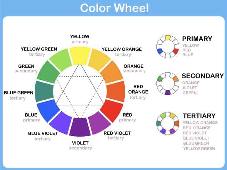
Sir Issac Newton in 1666 was the first to place the colors on a color wheel.

Color Basics – Understanding Color
There are three fundamental types of colors: primary, secondary, and tertiary. Each category exhibits distinct color qualities and characteristics.
Primary Colors
Three colors cannot be made by mixing any other colors together. These three colors are called primary colors.
These primary colors are:
- Yellow
- Blue
- Red
You cannot mix any other colors together to make these colors, but you can use them to combine them together to create different colors. Think of them as the ingredients in a recipe that cannot be changed, but you can mix them with other ingredients to make the recipe, like the vanilla, butter, and eggs in a chocolate chip cookie recipe.
Many artists may only use these colors plus white and black to mix all the colors on their palette. You can try to do a painting this way and see how you do with mixing colors. It is a very good exercise to learn how to integrate colors.
Secondary Colors
The secondary colors are colors that are mixed together by combining two primary colors together.
Here are some basic combinations:
- Red (primary colors) + Blue (primary color) = Violet (Purple
- Blue (primary color) + Yellow (primary color) = Green
- Yellow (primary color) + Red (primary color) = Orange
So therefore, the secondary colors which could be made by mixing two primary colors together would be:
- Violet, or as some people call it, Purple
- Green
- Orange
Tertiary Colors
Tertiary colors are made by mixing secondary colors with primary colors to make the color. The recipe would be one part of primary color and one part of secondary color.
Here are some color combinations and how the colors are mixed:
- Yellow (Primary Color + Orange (Secondary Color) = Yellow Orange
- Red (Primary Color) + Orange (Secondary Color) = Red Orange
- Red (Primary Color) + Violet (Secondary Color) = Red Violet
- Blue (Primary Color) + Violet (Secondary Color) = Blue Violet
- Blue (Primary Color) + Green (Secondary Color) = Blue Green
- Yellow (Primary Color) + Green (Secondary Color) = Yellow Green
So, the Tertiary Colors are:
- Yellow Orange
- Red Orange
- Red Violet
- Blue Violet
- Blue Green
- Yellow Green
This is what we call the primary, secondary, and tertiary colors. But it does not stop there, as there are still more things you need to know and discover about colors to understand the science of colorfully.
Warm and Cool Colors
The color wheel can be divided into warm and cool colors. Here is some basic information on warm and cool colors:
- Warm Color – These colors are considered to be vivid and energetic. Colors like red, orange, yellow, and some greens will fall into this range.
- Cool Colors – These colors give a soothing impression of calmness. The colors that fall into cool colors are more than blue tones, violets, some pink tones, and some green color tones.
Tint, Shades, and Tones
Tints, shades, and tones are where things can get a bit more confusing, as many people may feel this is the same thing. But in reality, it is not.
Here are the definitions of each:
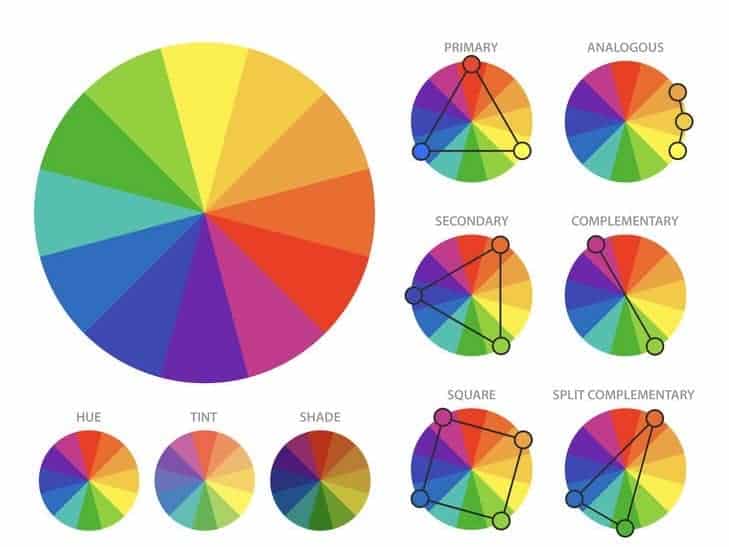
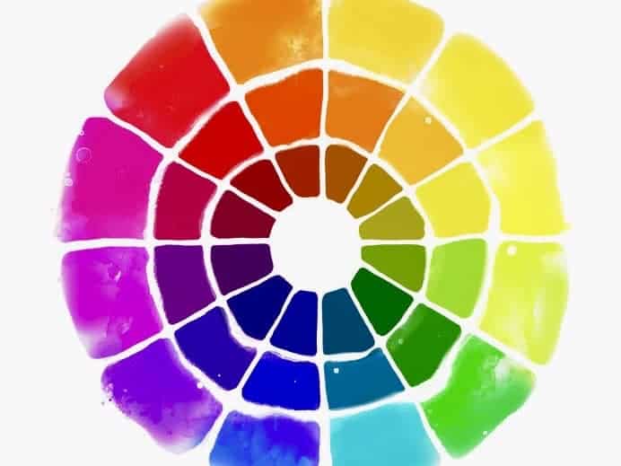
- Tint – A tint is when a color is made lighter by adding white to the color.
- Shade – If black is added to make a color darker, then that is considered a shade color.
- Tone – If grey is added to make the color different, then that is considered to be a tone color.

Understanding Color Wheel Color Schemes.
Reading a color wheel can take some time to understand the color wheel fully. Many artists may wonder why this is important, but once you understand the color wheel, it can help you to know how to mix colors better and what colors work well together.
Even if you feel that you have a great eye and do not need to know about the color wheel, it helps any artist to have this basic information and knowledge.
Complementary Color Scheme
Colors that are entirely opposite of each other are considered to be complementary colors. Using complementary colors, you can create high contrasts in your work and give it a vibrant look. This is especially true if you use the colors at full saturation.
Complementary colors can be more complex to use in large doses, but many artists work well with using many complementary colors in their artwork.
Here are some examples of complementary colors:
| Color | Complementary Color |
| Red | Green |
| Red Violet | Yellow Green |
| Violet | Yellow |
| Blue Violet | Yellow Orange |
| Blue | Orange |
| Blue Green | Red Orange |
Analogous Color Scheme
Analogous colors are next to each other on the color wheel. They usually match together well and can be very easy to use in your design and color palette work.
Many analogous colors found in nature are usually very pleasing to the eye to look at. But if you are using this color scheme, you need to be sure to have enough of a contrast in the colors so it does not look like the same color.
As a rule of thumb, you can use one color to dominate and another to support the first color by adding white, black, or grey to the color; you can then use another color as the accent to the first two colors.
I often use this a lot as I tint my colors on my canvas. I may start with a darker color and then add white to highlight the darker color. I find this technique works well for me and the kind of painting I do.
Here are some examples of the analogous color scheme on the color wheel:
| Dominate | Support Color | 3rd Color |
| Green | Yellow Green | Yellow |
| Red Orange | Orange | Yellow Orange |
| Red | Red Violet | Red Orange |
| Violet | Blue Violet | Red Violet |
This list above is just some basic examples as the list of combinations for this can really be endless.
Triadic or Secondary Color Scheme
The triadic or secondary color scheme uses colors that are evenly spaced around the color wheel. Secondary or triadic colors tend to be vibrant even if you are using some pale versions of the same hue.
To use Triadic colors successfully, you should allow one color to dominate and the other two to be used as accent colors.
Here are some examples of some triadic color scheme combinations
| Dominate Color | Support Color | Support Color |
| Violet | Orange | Green |
| Blue | Yellow | Red |
| Blue Violet | Yellow Green | Red Orange |
| Green | Violet | Orange |
| Red | Blue | Yellow |
You can use endless combinations of colors for the dominate and the colors you can use for the support colors. But the main thing about the triadic color scheme is that they are colors that are evenly spaced around the color wheel.
Split-Complementary Color Scheme
The split-complementary color scheme is a variation of the complementary color scheme. It has a base color and then two colors as a complementary color. This scheme is usually easier for beginners as it is harder to mess up.
The good thing about this split-complementary color scheme is that it has the same strong visual contrast as the complementary color scheme but less overall tension.
Here are some split-complementary color combinations:
| Base Color | Complementary Color | Complementary Color |
| Yellow | Red Violet | Blue Violet |
| Green | Red Violet | Red Orange |
| Orange | Blue Violet | Blue Green |
| Blue | Yellow Orange | Red Orange |
| Violet | Yellow Green | Yellow Orange |
| Red | Blue Green | Yellow Green |
Again, there are many combinations for the split-complementary scheme. The main thing with this is that there is the base color and then two support colors.
Rectangle (Tetradic) Color Scheme
The rectangle or tetradic color scheme is four colors that are arranged as two complementary pairs. This rich kind of color scheme has endless combinations of variations.
This scheme also works best if you allow one color to be dominant. But, like in most things in art, many rules are made to be broken when you break them for a reason. No matter what you decide, you should pay attention to the balance between the warm and cool color combinations.
Here is some example of Rectangular or the tetradic color scheme:
| Color 1 A | Color 1 B | Color 2 A | Color 2 B |
| Yellow Green | Yellow Orange | Red Violet | Blue Violet |
| Yellow | Orange | Violet | Blue Violet |
| Orange | Red | Blue | Green |
| Red | Violet | Green | Yellow |
| Yellow Orange | Red Orange | Blue | Green |
| Blue Green | Yellow Green | Red Orange | Red Violet |
Like many of the other color schemes, this rectangular combination has many possibilities.
Square Color Scheme
The square color scheme is similar to the rectangle color scheme, but all four colors are placed evenly around the color wheel. Like most color schemes, it works best if you allow one color to be the dominant color and pay close attention to the balance between the cool and warm colors in your artwork.
Here are some square color scheme combinations:
| Color 1 A | Color 1 B | Color 2 A | Color 2 B |
| Yellow Green | Yellow Orange | Red Violet | Blue Violet |
| Yellow | Orange | Violet | Blue |
| Yellow Orange | Red Orange | Blue Violet | Blue Green |
| Orange | Red | Blue | Green |
Best Locations to Match or Check Colors
According to your lighting, colors can change, making matching or checking your true color difficult. This is especially true with many of the artificial lights and light bulbs that are used today.
Here is some information on matching colors:
- Natural Light – By far, the best place or way to check a color and match the color is in natural daylight. If you can bring the color outside to check the color, this is always a very good choice. If you can’t go outside try to go near a window with good natural light.
- Halogen Bulbs – Halogen bulbs give the closest light to the natural light than other bulbs. They are called white light. They can also get hot, be expensive, and not last very long. But they do give a true light like natural light.
- Compact Fluorescent bulbs (CFL) – Compact Fluorescent bulbs can also be a good choice as they come in an extensive range of colors and are energy efficient.
Try to avoid light bulbs that are too yellow, such as incandescent bulbs or other light bulbs that have a lot of yellow tones. This will make matching the color very difficult.
Using the right color and color combinations can make all the difference in your art and artwork. Colors and the combination of colors can be a powerful design element if used correctly and properly, so this is why every artist needs to have some basic knowledge of color, the color wheel, and color combination schemes.
Frequently Asked Questions
What Is The Definition Of The Color Wheel?
The color wheel is defined as a circle with different colored sectors showing the colors’ relationship. The color wheel and color wheel theory are helpful for artists, designers, and anyone who needs to work with and understand color.
What is Color Therapy?
Color therapy is based on the idea and belief that light and colors and how we view colors can cause electrical impulses in our brains that will help to stimulate hormonal and biochemical processes in our bodies. These hormonal or biochemical processes can either calm or stimulate us, causing different reactions or feelings.
What is color harmony, and why is it important in art?
Color harmony refers to the pleasing arrangement of colors that create a sense of balance and aesthetic appeal in art. It’s important because it ensures that the colors in a piece of art complement each other, creating a cohesive and visually satisfying piece.
Can understanding color theory improve my art?
Yes, a solid understanding of color theory can greatly improve your art. It enhances your ability to mix colors effectively, choose color schemes that work well together, and use color to communicate your artistic intentions more clearly.
Why is it important for artists to experiment with color?
Experimenting with color allows artists to discover unique color combinations, develop a deeper understanding of color relationships, and find new ways to express themselves through their art. It encourages creativity and can lead to the development of a distinctive artistic style.
How can color affect the mood of a painting?
Colors can significantly influence the mood and atmosphere of a painting. Warm colors (reds, oranges, yellows) can evoke feelings of warmth and excitement, while cool colors (blues, greens, purples) often create a sense of calm and serenity. Artists use color to convey emotions and set the tone of their work.
What is color harmony and why is it important in art?
Color harmony refers to the pleasing arrangement of colors that create a sense of balance and aesthetic appeal in art. It’s important because it ensures that the colors in a piece of art complement each other, creating a cohesive and visually satisfying piece.
Related Content
Is The Procreate App Beginner Friendly?
The Procreate App is beginner-friendly as it is pretty easy to learn. But like any other program, you will need to know some of the program’s essential functions, which may require a learning curve. But once you have mastered the Procreate App, you can use it to produce digital art, help you layout your painting, or as a digital art journal.
Discover more by reading Is The Procreate App Beginner Friendly? by clicking here.
Is Procreate Worth It? 11 Reasons Why Artists Should Use Procreate
Procreate is an iPad app that is definitely worth the cost and time to learn. It is an app that can help you become better as an artist because it will save you time and allow you to be able to experiment with your art digitally before you paint anything onto the canvas. The Procreate App is worth the money, time, and effort when used correctly.
You can discover more by reading Is Procreate Worth It? 11 Reasons Why Artists Should Use Procreate by clicking here.
Where Is The Color Picker? Procreate’s Color Tools Explained
The color picker tool allows you to pick any color in Procreate and use the same color again. An eyedropper tool helps you to be able to choose the exact color you want to use in Procreate. The color drop tool lets you drop a specific color onto the canvas. Essentially, all these Procreate tools enable you to pick the correct color for your artwork.
To discover more about Where Is The Color Picker? Procreate’s Color Tools Explained by clicking here.


